Homepage Design Tips to Drive Website Conversions
Author & Editor
Founder & CEO
Published on: Feb 1, 2023 Updated on: Oct 3, 2025
Table of Contents
Your website’s homepage design will make or break the success of your brand on the internet right now.
We’re not kidding. 75% of online consumers judge a brand’s trustworthiness and credibility based on their website design. If your homepage is the first thing customers see when they check out your brand, and it isn’t up to snuff, then you lose out on the majority of your potential customers online.
70% of small businesses don’t have clear calls-to-action (CTAs) on their website homepage. Yet 86% of online consumers want to see clear product and service information within the first few seconds of their website visit. Do you want to be part of the 70% that loses out on conversion opportunities on the internet?
Or would you rather leverage your online consumers to drive big business wins this year?
Let your expert web development agency guide you through the importance of your brand’s website homepage design right now.
What is a homepage and why is it important?
In digital marketing, a homepage is the main or introductory part of a brand’s website.
The web design and marketing of any homepage is crucial to your business success. When done correctly, it can serve as the solid foundation for your customer’s excellent user experience with your brand today.
Here are a few more reasons why an effective homepage design is important to your business success:
- First impressions. Your homepage is usually the first thing that potential customers will see when they check you out online. An effective and well-made homepage will give your visitors a great first impression, instantly conveying your brand’s personality and values while building trust with your audience at the same time.
- Better user experience. An effective website will inherently improve the customer experience with its great UX design. It will make navigation easy for visitors, helping them find what they're looking for while reducing your bounce rates too.
- Increased conversions. With effective web development, you’ll be able to smoothly guide potential customers towards conversions like signing up for a newsletter or making a purchase. This inevitably increases traffic and engagement, and drives up conversions in the long run.
- Improved search engine rankings. The benefits of a great UX go well beyond the bounds of your brand’s online presence. If you have a well-planned homepage that is optimized for search engines, you’ll be able to improve your search engine rankings as well. This can help drive more traffic to your business and increase your visibility online.
- Competitive advantage. All of the aforementioned reasons on this list inevitably serve to set your brand apart from the rest of the competition. A unique and visually appealing layout will help you stand out from the crowd, attract more attention, and build a stronger brand identity versus other competitors today.
Feeling a little more convinced about the business benefits of a great homepage design? Then keep on reading to discover how to develop your website to reach every business goal right now.
How to design a mobile-friendly homepage
When you want to drive digital success with your brand’s online website, your homepage design has to be effective and responsive for customers, wherever they are, and whatever device they use. That includes their use of your digital channels on mobile devices as well.
So check out these general tips on how to design a website homepage for overall responsiveness and mobile-friendliness today.
1. Decide on the primary goal.
The first thing you should do when making any mobile channel is to decide on its primary goal in line with your overall business objectives.
When the goals for your business website are specific and clear, your homepage will be able to reflect that same clarity in design. This clarity in your layout will guide audiences towards achieving your business goals, whether they open your brand’s site on desktop or mobile today. Here are a few examples of primary goals for a main landing page:
- Information dissemination. A webpage that is dedicated to information dissemination will have clear headlines, subheadlines, and descriptions that capture your brand’s identity and personality in just a few words.
- Selling/sales. If your goal is to drive sales, then your main landing page might look more like an ecommerce site that lets visitors complete their buyer’s journey in just a few clicks.
- Lead generation. For brands that are focused on lead generation, you’ll see clear and specific calls to action that entice people to become leads, like to subscribe to a newsletter, sign up for free trials, contact an agent for further information, and more.


Figure 1. Mobile homepage with information as the primary goal. Screenshot of the Palawan Pawnshop Palawan Express Pera Padala app.
Photo courtesy of Palawan Pawnshop
2. Identify your target audience.
Good design only matters if the right audience is there to use it. So the next thing you should do is to identify your target audience so that you can begin laying elements out based on their needs today.
You can collect information on your potential customers by analyzing customer data, gathering customer feedback, and doing a lot of social listening. These practices will help you form a clear understanding of your users, helping to narrow down your ideal target audience for better digital marketing channel design.
This well-researched audience profiling will also serve to bolster your web development, making it more effective in achieving your overall business goals.
3. Prioritize customer needs and experience.
Last but not least, you need to apply customer-centric web design concepts that prioritize customer satisfaction for the best possible user experience today.
Combine the research you conducted with the previous steps on this list. How might you entice the target audience to achieve your website’s primary goal? Once you answer this question, you can effectively utilize customer-centric concepts to guide users towards achieving your primary goal on this digital channel.
In general, you should make your website user-friendly and easy to navigate so that customers have a good experience on it. By including a legible layout, rendering responsive design, and having fast page loading time, this digital marketing channel will respond to the user’s needs more efficiently.
How to design a homepage for conversions
Whether you’re developing for mobile or desktop use, you definitely want your homepage to be optimized for business conversions. To create a landing page that’s sure to drive winning conversions for your brand, you need to test and optimize it multiple times first.
You can do this by running A/B tests on your landing page and its individual elements. The step-by-step nature of this kind of testing, alongside its requirement to optimize as you go, will guide you towards finding new ways to improve your business’ website.
As you continuously test and optimize your copies, content, loading speed, and more, you’ll gain tons of insightful data that’ll help you make the best digital channel possible for your customers’ needs and your conversion goals today.
Elements to include in homepage design
What elements should you definitely include in the creation, testing, and optimization of your digital front page today? Here is your web design checklist of the essential elements for any landing page, including the elements’ respective purposes for your business:
- Headline and subheadline. The headline and subheadline are the first and second things visitors read when they visit your website, respectively. In the example below, the headline is our company’s motto, while the subheadline is an exciting promise of what’s to come for our potential customers.
- Navigation menu. Navigation menus, on the other hand, clue customers into the information and services they can avail of as they travel through a site. In our example, the navigation menu is clearly highlighted at the top of our homepage.
- Call to action (CTA) buttons. The copywriting for your CTA buttons should be clear and concise, with a specific call that entices customers to action. In the example below, the CTA is a simple and clear “Let’s Talk.”
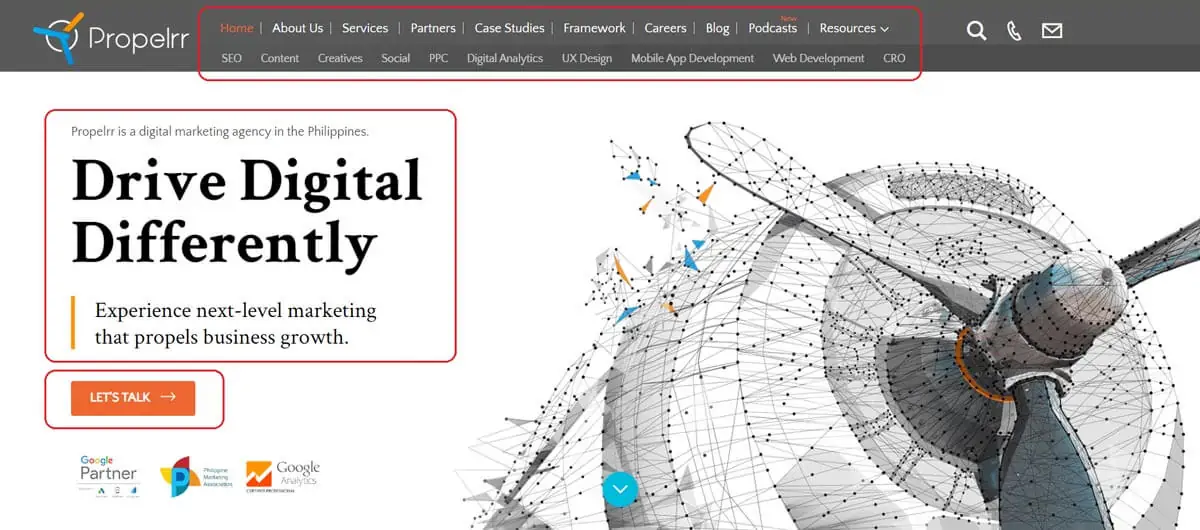
Photo courtesy of Propelrr
- Hero image or video. Depending on how visual you want your main page layout to be, you can include a hero image or video to attract customers and give them further information on your brand’s identity, goods, and services.
- Footer. Even if this element is at the bottom of your page, the footer is still a critical part of your website layout. Why? Because it usually contains your sitemap, brand logo, contact information, social media icons, and privacy policy - all of which are pieces of information that your customers need today.
- Social proof elements. Last but not least are your social proof elements. You need these to build trust among customers, assuring them of your reliability and legitimacy as a brand. These can come in the forms of:
- Testimonials: In the example below, we show three of our best testimonials to showcase the quality of our brand’s services.
- Ratings: If it applies to your business, you can also include numerical ratings to quickly showcase your brand’s quality, ex. Michelin star, Forbes Travel Guide ratings, etc.
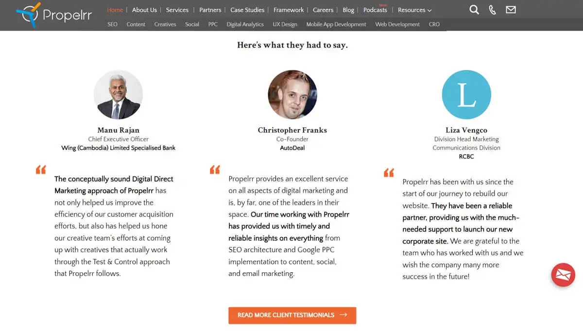
Photo courtesy of Propelrr
Best practices for designing website homepages
As you go through this comprehensive guide, you will find tons of expert tips for good web design workflow. Keep this learning spree going by taking a look at some of the best practices for web development today:
- Keep it simple and uncluttered. This applies to both your text and visuals. Keep your elements clear, concise, and uncluttered to avoid any distractions from your potential customers’ conversions.
- Using white space effectively. Like in the example below, give your text and visual information room to breathe through the use of white space too. This will remedy the problem of cluttered-looking elements on any digital channel.
- Using color and typography effectively. The effective use of color psychology and typography (like in the example below) on your landing pages will enhance usability and flow without overloading the online user.
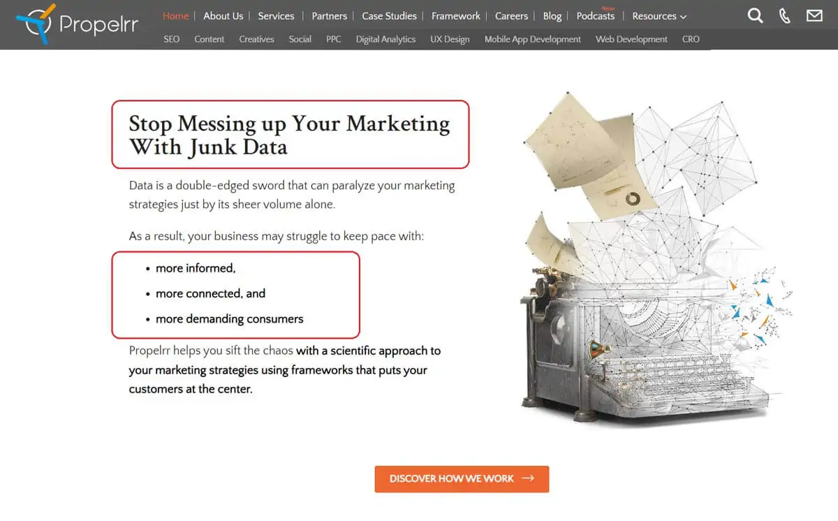
Photo courtesy of Propelrr
- Maintain visual hierarchy. The appropriate visual hierarchy of information will help lead visitors towards CTAs, priority pages, and other crucial elements that guide them towards a conversion.
- Prioritizing mobile responsiveness. When this critical digital channel is optimized for mobile responsiveness, you capture audiences on both desktop and mobile, increasing brand trustworthiness and lead generation on multiple fronts.
Case studies on how to design your Google homepage
Having a hard time visualizing ways to design a homepage for your brand? Check out these four case studies on how to design your Google homepage from top businesses in the most competitive fields today.
Apple
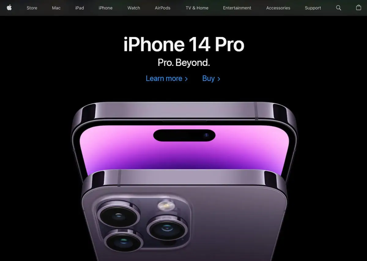 Photo courtesy of Apple
Apple’s website goes hard on their hero image and lets this gorgeous iPhone 14 Pro photo take center stage. This brand’s identity has also always been known for its sleek, professional look and straightforward writing style, so the headline and subheadline serve to bolster this brand identity as well.
Airbnb
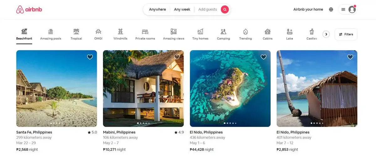 Photo courtesy of Airbnb
While Apple’s homepage primary goal is obviously sales, Airbnb has to dip into the realms of sales, information dissemination, and lead generation.
So it consolidates all its goals by giving customers what they want most: information on the best Airbnbs in their area, with price ranges and beautiful location photos to smoothly guide them through the reservation process.
Dropbox
 Photo courtesy of Dropbox
With its written copies, Dropbox addresses one of the biggest pain points of its customers: the fear of unsafe cloud storage.
By assuring visitors of its trustworthiness in the first few lines of the landing page, Dropbox drives more people to sign up for their reliable, private, and secure services today.
Shopify
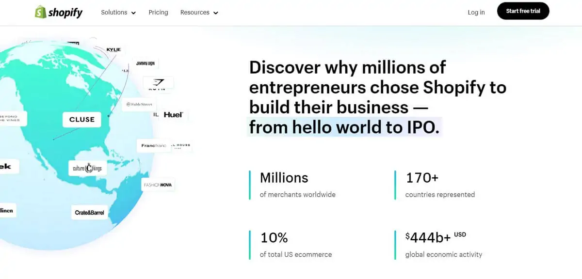 Photo courtesy of Shopify
When you scroll down Shopify’s website, you’ll find tons of social proof elements that highlight its popularity all around the world. This makes total sense, given the brand’s background as a global ecommerce platform that helps small businesses everywhere build online stores for millions of ecommerce customers.
Key takeaways
With all these exciting opportunities for your business, why wouldn’t you want to design a homepage that drives conversions for your brand today?
Drive big business wins this year when you develop an effective and customer-centric website today. Here are some final takeaways from this comprehensive guide to get you started on your winning journey right now:
- Remember: first impressions matter. With 75% of consumers judging your brand based on your website, you need to make sure your first impression with them is a great one.
- Make it mobile-friendly. Respond to user needs on all fronts by making your content responsive and mobile-friendly.
- Design with the customer in mind. The homepage is meant to respond to their needs, anyway. Execute homepage design ideas that have your users in mind to ensure positive responses from potential customers today.
Have any other pressing web development questions? Send us a message via our Facebook, X, and LinkedIn accounts. Let’s chat.
Subscribe to the Propelrr newsletter as well, if you find this article and our other content helpful to your needs.
