How To Maximize Web Design & Digital Marketing For Business Results
Author & Editor
Senior Software Engineer
Published on: Feb 20, 2023 Updated on: Jul 29, 2024

Table of Contents
With all the screens and visual technology available, there is no doubt that web design and digital marketing go together. With the right collaboration, they can be a powerful combo.
When you look at it separately, many assume that web design couldn’t possibly have that big of an impact with your digital marketing efforts. But as a web development company that specializes in digital marketing, we argue otherwise.
Learn more about why we think web design impacts digital marketing more than you think it does.
What is web design in digital marketing?
Web design in digital marketing is effectively crafting and telling a story on your website that resonates with your audience. You can communicate this through website copies, images, videos, and all other important web design elements that reflect your brand.
The main goal is to attract and communicate with your target audience, but also function well as a platform for marketing your services and products.
How web design affects digital marketing?
The art and science put into both practices are concentrated at providing quality customer experience – providing interactions, online journey’s and user experiences that are seamless, free of friction, and optimized so customers keep coming back to either engage or even transact or convert.
This is one of the main reasons why both are important elements in your digital strategy.
The importance of web design in digital marketing
Here are the specific ways web design and digital marketing go hand in hand through to achieve many benefits for your brand and business.
1. Create an excellent first impression to your audience
Every modern buyer’s journey typically starts with an online search. So like it or not, digital-first customers can judge your business based on the content you have online.
They can find you through different ways or channels, but more often they find you on Search. They either type the name of your business if they recall it or use different keywords that describe your business to find out who you are, learn more about your business, or see other options.
2. Builds a cohesive digital branding
Your website is your online storefront. This makes it among your most important brand assets. A website gives you the space to tell people who you are, what you bring to the table, and what makes you unique and different from others.
When done right, it could help boost your credibility and promote customer trust. Web design and digital marketing are one of their objectives to boost brand awareness.
3. Better SEO ranking for your website.
When you invest resources to build a customer-centric website, search engines reward the websites with high Core Web Vital scores with better visibility to widen your reach.
But take note, focusing on these optimizations won't magically make you jump to the top of search rankings. But these guidelines can help make sure your web design contributes to the overall performance of your business objectives.
4. Get quality traffic and conversions on your website
It’s one thing to attract visitors and keep them, it’s another to encourage them to do business with you. When you invest time, effort, and resources in a conversion-centered website design, you reduce the customer’s hesitation to purchase from your business.
5. A well-designed website helps you stay competitive
In this tech-first age, businesses are trying to one-up one another in providing quality customer experience to make them the top-of-mind choice.
If your website is not optimized for the best user experience, you’re at risk of losing not only your online presence but also your competitive advantage. We don’t want that, do we?
Now that we know the WHY, I’m sure itching to know more about the HOW.
Web Design Tips To Improve Your Digital Marketing Results
1. Always design with responsiveness in mind
This is a crucial part of modern web design as your website should be optimized for different devices and screens to provide the ultimate user experience no matter what device.
Responsive is more than just a device issue, it goes hand-in-hand with accessibility. By ensuring your website is adaptable, you're making it easier for people with visual impairments or those using assistive technologies to easily navigate your website.
Who knows, this can also be your competitive advantage.
2. Simple designs can be effective .
Remember, you want customers to act. If the website is too cluttered or complicated, they might not get the message you’re trying to convey and leave your platform altogether.
It will be helpful to ask the following questions when you’re in the process of website development:
- Is the page visually attractive?
- Is the text readable and scannable?
- Is the layout easy to understand?
One example we appreciate is this design from pitch.com:

In the first fold, the header already presents its primary benefit to its target audience— win more deals. With the text centered, this leaves enough negative space to focus on the text but also on the call to action highlighted in white of “Get started for free.”
As you scroll through the page the user is presented with social proof of its customers, its product F-A-B (features, advantages, and benefits), and customer reviews.
Its design is clean with no flashy elements, but with a hint of action each fold that keeps your brain entertained.
3. Prioritize simple and easy navigation
Your website should make it easy for people to find what they’re looking for.
If you need to declutter your navigation bar, then we suggest including website categories at the top of your homepage to guide users in finding what they're looking for with just a glance.
Ideally, your site should be able to serve necessary information in under three clicks.
Accessing essential details should be quick and simple. Let’s look at the example set by Mazda:

The sleek, simple, and Intuitive navigation ensures you can effortlessly find what you need. Critical information is just a few clicks away, saving you time and frustration.
4. Keep the search button visible
Speaking of navigation; no matter what page you are on, keep the search bar visible so that users can easily search through your website content.
While we’re on the topic of search, it’s best to have search suggestions prepared. You can either provide the most popular searches or add an autocomplete option. This helps the user in navigating, but can also help you in identifying what a typical user would look for in your website and identify which parts you need to add, improve, or give priority to.
5. Fast website loading.
Your website should have a page speed that fully loads a page in three seconds or less. Otherwise, there’s a big chance your users could bounce.
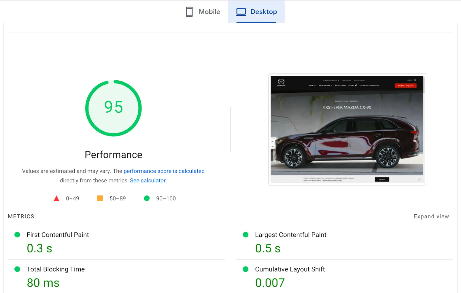
To get more insight as to how to improve loading speed, here are Google’s three Core Web Vital (CWV) factors that can help:
- The Largest Contentful Paint (LCP). This measures the loading time a website takes to fully display, which ideally shouldn’t exceed 2.5 seconds.
- Interaction To Next Paint (INP): Measures website responsiveness, which websites should strive to have an INP of less than 200 milliseconds.
- Cumulative Layout Shift (CLS). This is a measure of your website’s visual stability, which ideally should have a score of less than 0.1.
This is an example of how Google measures Core Web Vital Scores:

Google provides suggestions at the end of every CWV report to see what you can improve on. But given these meticulous user experience criteria points, it’s best to consult a professional web development company to improve the technical aspect of your website for SEO.
6. Use relevant and high-quality images
The average attention spans are — shorter than ever. This makes relevant and high-quality images a must to communicate with your target audience.
Of course images should be visually appealing, but it needs to speak to your audience in a way that resonates with them. For examples, strong and captivating images can create a stronger connection with your customer and leave a lasting impression.
One more way images improve your website design is that with strategic use and placement, images can break up large blocks of text, making your website content easier to digest and navigate.
7. Use visual distinction on different elements.
For example, the title of your blog posts must be bigger in font than that of the bodies. The search bar must be at the top right corner of the website with a placeholder text search and a magnifying glass icon. The calls to action, meanwhile, are traditionally placed in a button.
This will allow users to click on it and be redirected to a corresponding landing page such as a form for a newsletter subscription or a payment portal. The visual distinction makes your website easier to understand and use.
8. Timely responses.
AI-powered chats recognize keywords in messages and offer instant answers to customer queries. Even while you’re asleep, they’re at work, extending assistance to your potential clients.
Smart responses. With Machine Learning, chatbots deliver not only timely responses but also smart canned answers, especially to basic queries. This is important because most people don’t bother going back to a website when they don’t receive meaningful customer service when they need it.
Critical information. Chatbots leave important data about every chat in the backend for your review. This can help improve your marketing strategies, moving forward.
9. Exercise consistency in everything
Your website is your storefront, maintaining a consistent user experience across your website is paramount to reinforcing brand identity.
The visuals and typography must be uniform across all your website pages. Otherwise, you’ll confuse prospective clients and lose their trust. Use a brand style guide to keep your team aligned and enhance usability, allowing visitors to navigate effortlessly and find what they need quickly.
Key takeaways
While they are two distinct disciplines, web design and digital marketing go together in many ways. A well-designed website can help you achieve your marketing objectives. In turn, marketing tactics – including search engine optimization and social marketing – can yield better outcomes through a well-designed website.
In summary:
- Prioritize your site visitors. The strategies and performance measures mentioned above all point to improving users’ experience. By focusing on this aspect, alone, learning more about the kind of audience you’re trying to serve, can help you design your website in a way that benefits them. In turn, these efforts can help benefit your business.
- Begin with the end in mind. While a well-designed website ticks off digital marketing goals intuitively, it’s best to be intentional about incorporating these objectives into your website development process. From the get-go, consider what you want to accomplish; so you can reflect this in your layout, navigation, branding, and content. Create a web design checklist to help you streamline your process.
- Professionalize your online image. As you consider the end-users, it’s also important to think about your business image. How do you want to be perceived on the Web? If you want your customers to trust you, optimize your website’s look and function for them.
If you just want a quick chat, reach out to us via our social platforms: Facebook, X, and LinkedIn.
Do you need more tips on tried and tested web design marketing practices? Sign up for our newsletter and if you have any questions, don’t be shy and contact Propelrr.
