Conversion-centered Design Principles to Drive Better Results
Author & Editor
Founder & CEO
Published on: Mar 23, 2022 Updated on: May 21, 2024
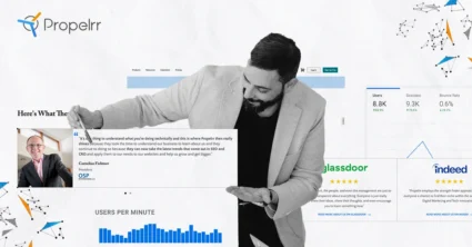
Table of Contents
The conversion-centered design principles conceptualized by Unbounce’s Oli Gardner have become textbook basics for developing conversion optimized websites.
If you find yourself struggling with connecting with your website visitors and turning them into paying customers, it may be worth your while to study the basics of conversion-centered design. In essence, these principles address through the power of intelligent designs, the basic factors that lead a customer to convert (or not).
Years of web design and development experience have carved these principles in our DNA, thus helping us develop our own practical approach for applying them in our projects. In this article, we distilled our best tips so you can start applying them to optimizing your websites for better conversions.
Let’s discuss.
What is Conversion-centered design?
Conversion-centered design principles highlight the marrying of design and user interface principles to boost your website sales, or what is simply known as conversion rate optimization.
These optimizations can be done on your entire website, or individual landing pages, sign-up forms, surveys, and other digital touchpoints you’ve built for your audiences, and are critical to leading the visitor to complete your conversion goals.
But apart from those, conversion-centered design principles are ultimately about improving website engagement and encouraging visitors to keep interacting with your brand's website. And sticking to just being user-centered, or conversion-centered in design won't do much to meet that goal.
Now, web developers should keep a mindful balance of both in developing their websites. Here are some specific tips and tricks on how to apply the conversion-centered design website engagement using the conversion-centered design principles.
Boost user engagement with the conversion-centered design principles
1. Create focus
Any time you build a landing page, you're up against something else that could potentially distract your target audience. It could be anything from an Instagram update to breaking news alerts on X.
These distractions can lead to you losing your customer before they accomplish your set goals. It is then the first priority of conversion-centered design to establish focus. By that, any design feature on your landing page should be dedicated to achieving a single campaign target.
Visitors are more likely to get confused or overwhelmed if you give them too many signals, choices or calls-to-action. Sure, promoting your e-book, informing guests about your newsletter, enticing them to join you on X, and selling them your merchandise all at the same time would be fantastic. However, people can only concentrate on one action at a time. On a landing page, the more options you have, the more users will leave.
How to apply this principle in your website development:
- Increase the exposure ratio on your landing pages and plan your marketing strategy with a single target in mind. The ratio of the number of items you can do on a website to the number of things you can do is referred to as the attention ratio. The focus ratio on the best-converting landing pages is always 1:1.
- Choose one target for your landing page and build your concept around it. Begin by answering the question: “What is the primary action we want visitors to take on this page?” This will serve as the compass in the design process.
2. Build structure
A landing page based on the conversion-centered principles not only looks fantastic, but it also gently encourages guests to click down and take action. It is hence important to develop a natural flow for your landing page.
Specifically, you must strike a balance between the content to make it not just aesthetically pleasing and intuitiveness of the flow of your page. A good layout will not only help you overcome the fear of working with a blank canvas, but it will also save you a lot of time and effort in the long run.
How to apply this principle in your website development:
- Start by developing an informational hierarchy. Consider the various elements that can help your page achieve its goal and write them down in the most logical order. To decide the layout of your page and how broad to render key areas, highlight the items you believe are most relevant.
- It's important to strike a balance between your visuals and your text. On the page, they must cooperate and support one another. You'll have a much harder time if you treat them as two independent ventures.
- Once you've agreed on the order of each segment, consider the flow from the viewpoint of a visitor. What amount of content would each segment require? What would happen to the images? How do you make the parts visually fascinating by breaking them up? What you don't want to do is scatter content around.
- A wireframe will assist you in visualizing what goes when, how much copy you'll need, and how the final product might appear. You may use a pen and paper to make a basic wireframe, or use an online tool like Sketch or Miro to make something more detailed.
3. Stay consistent
Landing pages are sometimes referred to as "standalone." They operate independently of the website, allowing you to experiment with new ideas and iterate more quickly than a web developer. But just because your landing pages can stand on its own doesn't mean your design has to.
As you begin to build your website, keep in mind the whole world of your brand as well as your audience's path. Your visitors would be more likely to feel like they've "landed" in the right place if you keep your landing page aligned with your other properties, such as your website and advertising.
How to apply this principle in your website development:
- It's all about the relationships you create with your target buyers. When it comes to design, this ensures that the landing pages and website should preferably use the same fonts, colors, and types. Refrain from doing something out of the ordinary or experimenting with a modern look. When you do this, you run the risk of alienating your clients.
- Design is the first thing visitors will notice on their journey from pre-click to post-click because our brains process visual information 60,000 times faster than text. You need to build a deep sense of pairing in the minds of your guests to make the landing page feel important to what they saw before.
4. Show benefits
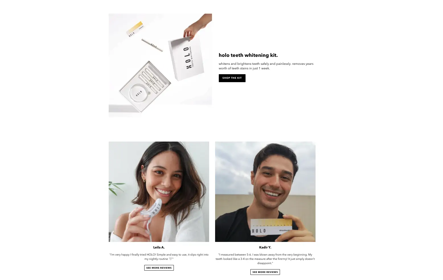
When it comes to landing page design and optimization, the graphics are your chance to demonstrate why visitors should be interested in your offer. Photography, illustrations, and videos can help you interact with your guests on a more personal level and catch intrinsic emotional rewards that copy alone cannot completely convey.
It's not about picking photos that sound good or go with the page's color scheme. You want to show incentives so that guests can see what the offer will do for them and how it can help them.
How to apply this principle in your website development:
- When visitors arrive, the hero shot is the first visual they see. It should be eye-catching, but it should also explicitly demonstrate the advantages of your offer.
- Your hero shot should be crisp and accurate. Even if they don't read the headline, visitors should be able to recognize your hero icon and appreciate the purpose of your landing page. Don't be too cutesy or imaginative about it, so you could end up misleading visitors with the completely unexpected.
- Take pictures of actual people using your product or service. They are much more engaging than conventional stock images, and they simply demonstrate what visitors should expect from your offer.
- Choose graphics that portray optimistic feelings such as excitement, pride or love if you want to create a close bond with your visitors. You may also use photographs to agitate the visitors' pressure points and convey negative feelings.
5. Draw attention
Peacocks have vivid plumage, tabloid magazines feature controversial statements in big print on their covers, and often people use pictures of fluffy dogs on their Tinder profiles to attract attention.
Colors, fonts, patterns, and shapes are all essential. These are the subtle interface features on your landing page that help you attract attention to specific points of interest. You will use them to draw the visitors' attention to the most important part of your page: the CTA.
How to apply this principle in your website development:
- Start with your brand's colors when choosing colors for your landing page. Although most landing pages have a white background, you can consider playing with different bursts of color to add visual appeal and break up your page.
- There's another crucial style guideline to remember after you've decided on your colors for your landing page. One of your colors should always be set aside for your call to action—ideally the boldest and most eye-catching one. This way, they'll automatically stand out and attract visitors' interest.
- Decide which content on your website is important, and use headers, bold, italics, point type, and colors to help frame it.
6. Design for trust
When a visitor clicks on an ad, they are taking a risk. There are a lot of dubious websites and scam deals on the internet that are practically "too good to be real." If someone is engaging with your brand for the first time, you must design with confidence. Establish your reputation by assembling social evidence that is not only compelling, but also believable.
How to apply this principle in your website development:
- A testimonial that is incorrectly built will make the landing page seem less trustworthy. Visitors would believe you made up a fictitious customer and wrote this review yourself if you don't have those confidence signals. Make your testimonials believable and try to reach out to influencers for reviews.
- Your guests are well-informed. They can see whether a testimonial is phony or whether you're rounding up your rating scores too far. Don't owe them an excuse to click away and start looking for outside feedback on third-party review pages.
- Since logos are usually intended to capture a visitor's attention with odd shapes and colors, any consumer logos you use on the website should be desaturated. You should also make them a little smaller so they don't take away from the rest of the style.
7. Reduce friction
We get so wrapped up in trying to make our landing pages look amazing that we fail to check that they perform well as well. However, any issues visitors have on the page – whether it's a slight annoyance or a design flaw – could cost you conversions.
This is why you must consider the user experience (UX) and strive to reduce friction whenever possible. Make sure that the concept is both practical and enjoyable for all types of users.
How to apply this principle in your website development:
- A form can have a maximum of three to five fields. The number you choose is determined by your objectives and the detail that is most critical to your lead generation and sales activities.
- If you use a multi-step method, you'll have a better chance of getting more conversions. It's less overwhelming, so visitors are more likely to fill out their details.
- Make sure the content is well-represented by your page style, and keep the user interface in mind at all times.
- Keep your design simple, cut out your text, and don’t forget to nail your design.
- Get your landing page mobile-friendly
- Check your web pages and landing pages' speed
- Conversion centered design should always be accessible as possible.
Key takeaways
It's not easy to optimize websites to guarantee 100% conversions, because each visitor is different and has unique preferences. But with these principles in mind, you’ll be able to create websites that help lead you closer to your conversion goals. Here are a few more takeaways you should remember in applying the conversion-centered design principles for website optimizations:
- You must actively test new ways to involve consumers and interpret data on their behavior. With how rapidly the practice of digital evolves, you can't just set your ways on one strategy. Keep testing and uncover new ways you can improve your website performance and, more importantly, user experience.
- Conversions can fail faster than it took you to coax the visitor to end up on your website. Make their time worth it and reduce friction, distractions, and other confusing elements on your websites. Simplicity is quintessentially the entire point of conversion-centered design.
- Conversion-centered design is critical for modern company's to prosper in a competitive digital landscape. Because these days, you're not just competing with your local competitors but with a whole host of other alternative companies on the internet.
Do you have more ideas to improve your website engagements with conversion-centered design? We’d love to hear from you! Drop the Propelrr team a line over at our Facebook, X or LinkedIn accounts.