Mobile SEO Checklist To Optimize Performance for All Screens
Author & Editor
Founder & CEO
Published on: May 11, 2021 Updated on: Aug 29, 2025

Table of Contents
If the past pandemic year proved anything, it was the importance of a strong presence in the online landscape — and the crucial nature of mobile optimization. Mobile is the future of search. So it’s important that you incorporate mobile search engine optimization (SEO) into your current digital marketing strategies.
The ultimate mobile SEO checklist for SEOs and developers
In the age of mobile-first indexing for search engines like Google, you need the best practices possible to improve your lead conversion rates and ensure success for your online business.
Let’s get your optimization journey started with this action-oriented mobile SEO checklist.
1. Simplify navigation.
Platforms that are harder to navigate often exhibit higher bounce rates, since users would rather bounce than waste time on a badly designed website.
So whether you’re choosing a built-in platform or making a website from scratch, you should ensure that the navigation on your platform is as easy to use as possible.
2. Improve loading speed.
The next tip on this SEO checklist is to improve your loading speed. Think of it from the user perspective: would you like it if a site takes a while to load? Of course not. So remember to improve your site’s loading speed to optimize your SEO, too.
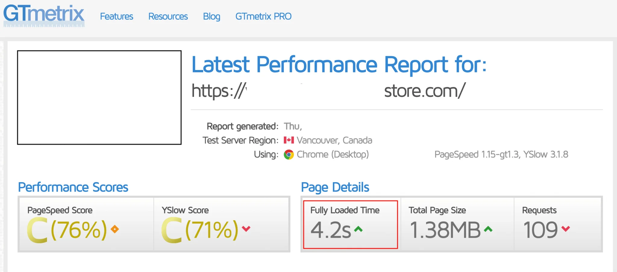
But what are some actionable ways to improve page speed? First, you can check how fast your page loads through Google’s PageSpeed Insights. The optimal loading speed for any site is three seconds, so if your page takes longer than that to load, then use Google Search Console for tips to improve loading speed. If you want even more ways to improve your page loading speed, then give these expert page speed optimization insights a listen as well.
3. Separate your URLs.
Have you noticed how URLs on non-desktop devices are different from URLs on desktops? If you’ve ever seen that little “m” before a mobile URL, that’s an “M. configuration.” That configuration ensures your site is optimized for your specific device.
With this URL separation, you can redirect users to a version of your site that is optimized for whichever device they’re using. By separating your URLs, you can ensure that your site is easier to navigate for better mobile SEO.
4. Set up dynamic serving.
Another way to curate user experiences for better SEO is to set up dynamic serving. Dynamic serving allows your site server to respond with different HTML and CSS for the same URL, depending on the device your customer is using.

Content management systems (CMS) like WordPress can help you set up dynamic serving for your potential customers. You, or the expert team handling your CMS, can ensure that your site responds with the appropriate content for all your customers, ensuring a better online experience and a better search ranking.
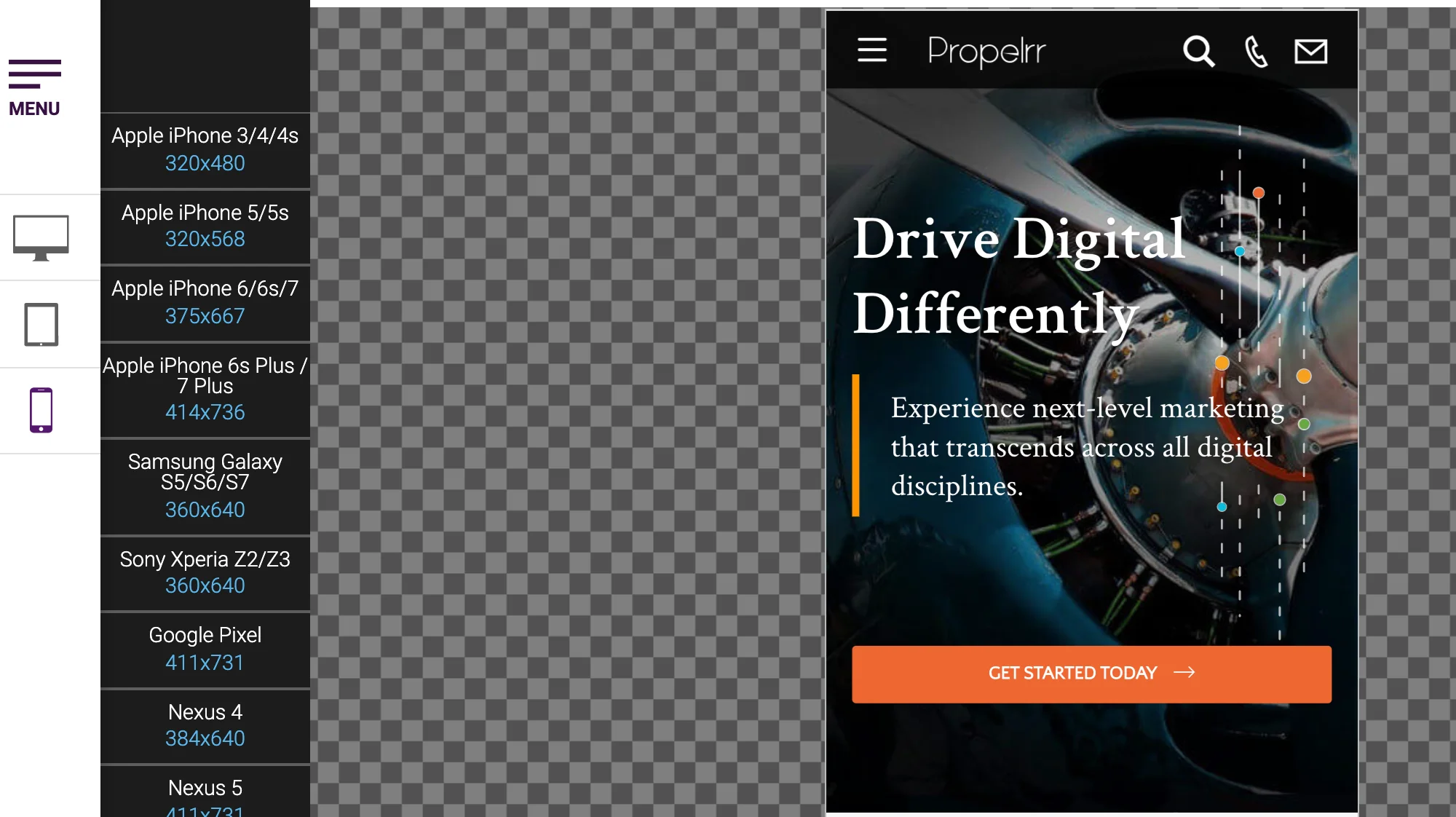
5. Utilize responsive design.
In line with the previous two points, ensure the most excellently curated site experience with responsive design. When you utilize responsive design, you can ensure that your page’s layout, content, and navigation respond to your user’s specific device.
Not only that, but by using responsive design, you can pull off curated experiences without different URLs or HTML. It’s incredibly user-friendly and won’t redirect users away from your main page.
6. Improve overall site speed.
Loading speed was brought up at an earlier point, so this tip serves to annex what you already know — that speed is king, especially when it comes to SEO.
To master your site speed, try optimizing the sizes of your photos or videos first. Big visual files can slow down site speed, so reduce visual file sizes for faster loading. Try minifying your CSS, JavaScript, and HTML resources too, to drastically improve your site speed.
Do your research on more web design checklists to discover more ways to improve your overall site speed.
7. Make content accessible to all devices and screens.
When your content is difficult to view on a phone or tablet, your users won’t be encouraged to stick around for a conversion. A simple way to optimize your mobile site is to make your content easy to read on phones or tablet devices.
How do you do that? Try including clear headlines with spaced-out subheadings and paragraphs. Don’t give users a huge chunk of text in one go; space your content out for better mobile friendliness.
If you’re using media elements like photos or videos, make sure they’re both high definition and speed-friendly as well. Heighten user accessibility by optimizing mobile content to improve your overall search ranking.
8. Use HTML5 for video and animated content.
Do you have videos or animated content on your page? Then make sure they’re as functional as possible with HTML5.
Previous versions of HTML only let videos be embedded on sites through multimedia plugins. Now you can use native HTML5 elements to smoothly incorporate videos and animations on your page.
The HTML5 <video> element lets you embed MP4, WedM, and Ogg formats on your webpage. The HTML5 <canvas> element, meanwhile, acts as your “drawing board” for multiple image frames for animation. Get familiar with this helpful programming language to optimize content for whatever device your customers use.
9. Don’t forget the “viewport content” tag.
In addition to the previous HTML5 tips, make sure to remember the “viewport content” tag when designing your phone or tablet website. This tag lets web designers control the viewport, or the user's readable length of a web page, through the <meta> tag.
Don’t forget to include this "<meta>" viewport element in all your web pages to provide your device browser the right instructions for controlling page sizes and scaling:
<meta name="viewport" content="width=device-width, initial-scale=1.0">
Make sure to discover more expert information about web development as well to improve your overall site usability.
10. Make use of “negative” space.
Let’s jump from web development to web design. To ensure viewability for whatever device your customers are using, utilize “negative” space wisely in your design.
Negative space is the empty space between your design elements. By using this empty space wisely, you actually make your content easier to view and better to read.
If you have lots of information to include in your site design, collate similar information to specific clusters. Use the negative space to separate information and indicate what content goes where. Make content easy to read on your web page to ensure a higher site ranking on any search engine.
11. Put social share buttons as a tab bar.
Social media share buttons can increase your visibility, especially when they’re easy to access with a floating tab bar. Users can just click on that floating tab bar to share their content on Facebook, X, or email.

This makes it easier for people to share on their socials, without the old copy-paste method. Not only is it convenient, but good for off-page SEO and content promotion too!
12. Optimize your mobile click-through rate (CTR).
Your CTR is a marketing analytics measure that tells you how many times people clicked on your company’s website on search engines like Google. This measure lets marketers know how good their SERP copies are, and how effective it is in encouraging users to click and read your content.
An effective organic CTR plays a part in your ranking. If you want to check your mobile CTR performance, head on over to your Google Search Console (GSC) Performance Report and compare your mobile versus desktop CTR.
13. Optimize title tags for mobile search engine results pages (SERPs).
This next piece of advice is a continuation of the previous tip. If you noticed that your desktop CTR is doing better than your mobile CTR on GSC, double-check your keywords on a mobile SERP to see exactly how they’re faring online.
The desktop versions of your title or description tags may not be optimized for other devices. For mobile, your title tag can be around 78 characters long, while your description tag can be around 155 characters long.
If mobile takes up a huge part of your site’s traffic but has a worse-performing CTR, try optimizing your tags for mobile SERPs instead. This can bump up your CTR and improve your overall SERP visibility, even if you’re not optimizing keywords for desktop.
14. Check if your pop-ups are mobile-friendly.
Everyone hates distractions, and intrusive pop-ups are the worst distractions of all. When you have intrusive pop-ups, you’ll turn off potential customers from your site and negatively affect your search rankings.
To improve your site’s usability and overall search ranking, include a visible click-out button on your pop-ups. This is especially important for mobile pages because pop-ups can take up space on your viewport and distract your potential customers.
15. Optimize your content for mobile users.
Need more ways to optimize your mobile content? Use Google’s Mobile-Friendly Test to double-check your usability and find more ways to improve. That way, you can really optimize your content for alternative device users and improve your search ranking.
Make sure to check out more data-driven strategies too from the digital marketing experts here at Propelrr.
Key Takeaways
A lot of helpful points were discussed in this comprehensive checklist. Here are three final takeaways to summarize all the lessons learned:
- Mobile is the future of search, so optimizing your site content for mobile will greatly improve your overall search ranking.
- Mobile SEO is intrinsically tied to all other elements of your digital marketing mix. By improving one aspect of your SEO, you’ll inevitably improve the rest of your digital marketing.
- Don’t be afraid to get help from the experts. There are a lot of ways to get started on your optimization journey. Get actionable insights from the best data-driven digital marketing experts in the industry.
Make sure to check out Propelrr’s Facebook, X, or LinkedIn for more mobile SEO practices for your website!