Mobile Ecommerce Design Best Practices and Examples
Author & Editor
Senior Software Engineer
Published on: Sep 13, 2023 Updated on: Mar 19, 2025
Mobile ecommerce design is a delicate balance between mobile development and ecommerce design.
With all the factors that could go into each – visuals, copywriting, coding, sales funnels, marketing – it could be a challenge to identify useful trends and best practices that benefit your business.
Mobile ecommerce design refers to deliberately crafting an app that has the capacity to sell products while optimized for mobile devices. On top of displaying items being sold, an ecommerce app is able to accept payments by integrating a payment processing system, and even in cooperation with programming, visual creatives, copywriting, and funnel marketing teams.
In the digital age, ecommerce mobile design continues to become more important than ever. The use of mobile devices and mobile apps is at an all-time high, not only for browsing activities but ecommerce itself. Overall, there are great reasons to build an ecommerce app to benefit your business, incorporating UX design tips from a experienced digital marketing company.
Best practices for mobile ecommerce design
There are several facts about mobile app development that highlight the importance of following best practices. Statistics on mobile app usage, the number of apps prospective buyers have on their phones, and the percentage of apps on app stores that are not downloaded show that not just any mobile app succeeds in capturing the hearts (and wallets) of app users. Ultimately, you want your ecommerce app to have features conducive to successful transactions and increased app usage.
1. Optimize for mobile devices.
For ecommerce mobile designs, platform optimization can have a huge impact on app usage, app downloads, app ratings, and ultimately, customer conversion:
- An app that loads slowly leads to users abandoning their cart at point-of-sale.
- A page layout that omits crucial buttons leads to confused or frustrated prospects that then seek other places to purchase your product.
- Mobile optimization is so important that even Google rewards mobile-friendly websites on its search engine.
We find that at the very foundations of great ecommerce design is platform-mindedness. Just as the social media giant Facebook has mobile sites m.facebook.com And mbasic.facebook.com separate from its www.facebook.com desktop site, an ecommerce website greatly benefits from having a mobile version.
What this ensures is that your mobile app possesses the right display and functionality in a way that’s apt for the platform it’s viewed on.
A site optimized for mobile devices has:
- Clear navigation.
- No critical visual issues such as text and images not fitting the screen.
- A decent loading speed.
While this is basic, several websites online still lack this essential factor.
Action step: Do an audit of your e'-commerce mobile app design (or blueprint if it’s still under initial development). Check to see if there are issues in navigation, layout, and loading speed. Look at menus, categories, and tags. Check navigation from the store homepage, the user’s profile page, category or search result pages, and product pages. Draw a chart if needed and identify any lapses in navigation.
2. Use responsive design.
Of course, nothing beats mobile-responsiveness. portrait and landscape mode aside, a site that displays superbly on a Samsung Galaxy S23 Ultra would look differently on an LG G6.
It’s inefficient to have different sites for each aspect ratio—something not even Facebook would do—which is where mobile-responsive features come in.
It’s not that screen sizes have no standard aspect ratios. Historically, standard aspect ratios themselves change over time, leading to what is initially considered weird displays in new phones. To keep on top of this ever-changing aspect, we’ve designed our site to be mobile responsive, and you can, too.
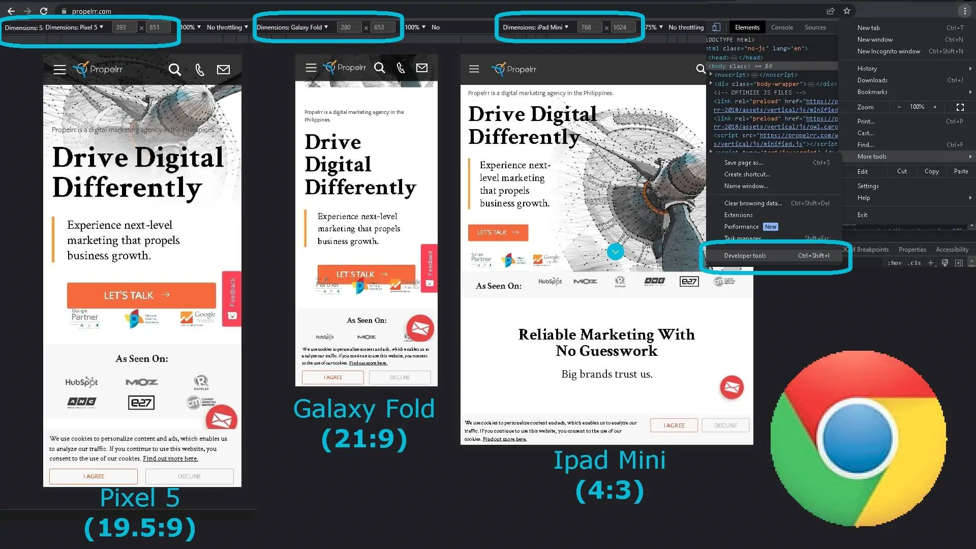
Action step: Try it. View the same website on different devices. Alternatively if you’re currently on desktop, go to Developer Tools on Google Chrome, turn on mobile view, check to see that dimensions is set to responsive, then drag and drop the dimensions however you wish.
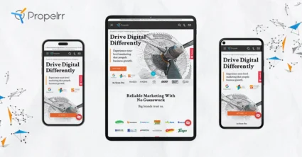
A website that didn’t undergo optimization for mobile would remain static, while sites like Propelrr demonstrate stellar responsive User Experience (UX) Design no matter the prospect’s device screen size.
Remember, aspect ratios affect more than your app’s display. It also affects its functionality and UX.
3. Prioritize user experience.
Speaking of UX, a positive user experience is the end goal to best practices such as the incorporation of mobile-responsive design. The following are a few action steps on how to create site design conducive to quality user experience.
4. Mind the fold and false bottoms.
This has to do with layout. “The fold” is a term borrowed from traditional publishing. The biggest news are placed above the part where a newspaper folds, so that the content is visible at first glance even while the newspaper is folded. In digital formats, “the fold” refers to the bottom of the screen.
There’s a key difference here. In print, minding the fold means placing important elements of content “above the fold”. The newspaper viewer can’t take the broadsheet with them unless they plan to buy it, so only elements above the fold are guaranteed to be visible to them. However, for digital, app users can access content “below the fold” wherever they carry their mobile device.
Thus, minding the fold in the digital format is less about placing everything above the fold in the page layout. Rather, it is more about ensuring that the viewer proceeds down your page below the fold thanks to a pleasant scrolling experience or engaging design. Avoid “false bottoms” through the use of gradients, diagonals, and directional cues.
5. Leverage built-in mobile features such as GPS, camera, and microphone.
A microphone allows for voice search, a camera allows for image search, and location helps with personalization.
Gone are the days when text was the only way to search, and manually-collected demographics the way to personalize customer experiences.
Unlike desktop devices that have external hardware power buttons for camera and microphone, mobile devices provide greater accessibility to these features. Culturally, device users are more likely to utilize their camera, microphone, and GPS on a daily basis on mobile as well. It’s a waste to underutilize this much functionality specific to the mobile platform.
User location would benefit your business by allowing you to make personalizations based on location. Image search and voice search make your ecommerce app more accessible by eliminating issues related to language fluency, product novelty, and accessibility. Users no longer need to know what a product is called, much less how to spell it, and still be able to purchase your product.
6. Support basic gestures.
Let your mobile users zoom in by pinching, or use double-tap to either wishlist an item or add to cart. This is convenient on mobile devices, more than double-clicking on a computer, so make use of it.
Just don’t forget to use some sort of indication that an item has been added/removed to the user’s wishlist or cart, so users know it’s by their own actions. This indication can be a change in button color or a fading animation. Simply mind your page’s loading speed.
7. Mind the thumb zone.
Like the fold, this has to do with layout or where page elements appear on the screen. Coined by mobile UX expert Steven Hoober, the thumb zone is the area of the screen users’ thumbs easily reach. This is an intersection of the area the thumb reaches for left-handed users and for right-handed users, and shrinks further up the screen. To work with the thumb zone, place call-to-action (CTA) buttons within it. Make the CTA buttons easy to tap.
8. Provide suggestions in search boxes.
You want to avoid letting your users switch tabs. Suggest search queries on your ecommerce app so they don’t have to look at their note app or search engine history. Even if what your users are looking for aren’t as complicated to memorize as phone models or X Æ A-12, suggested smart queries make it easier for prospective customers to make transactions on your ecommerce app.
9. Utilize clear and concise messaging.
Users on their mobile devices are more easily distracted than users on desktop computers. Not only can mobile users be situated in distracted situations such as public transit rather than a focus-inducing environment such as a library, office cubicle, or study table at home, mobile usage is less compartmentalized as work computers. Mobile devices are used for socialization, communication, everyday searches, and leisure all in one.
Thus, mobile users want messaging that’s greater than simply fitting on the screen. Instead, they want messaging that’s easily digestible even in transit, queue, and similar situations associated with multitasking and distractibility.
Action steps: Shorten text without losing specificity. For example, you may replace a “click here to know more” button with what is simply, “learn more”. To shorten text, you may employ the skills of copywriters. To check for clarity, you may ask for feedback from customers and testers.
10. Incorporate high-quality images and videos.
Informing prospects of the features and dimensions of your product is only the bare minimum. High-quality images and videos are crucial features that can convey the emotions, traits, and experiences you want prospects to associate with the products you’re selling.
Action steps: Make an inventory of your product’s physical features up close, far away, in lighting that shines over its surface, or in use. From there, identify traits or feelings your product’s appearance conveys. You may also note the types of customers they may appeal to.
For example, a phone that is sleek appeals to customers who find the adjectives classy, urban or tech-savvy positive. A close-up of that phone may convey the casing’s texture that appeals to customers who like luxurious products. A zoom-out of that phone may show how easily it fits the pockets of customers who are always on-the-go.
11. Streamline the checkout process.
A checkout process that takes too many pages can get in the way of checkout. Whether it’s user impatience, connectivity issues, live user context or loading speed, more pages could mean higher risk of incomplete transactions. You’d want as little barrier to entry as possible between you and a prospect’s purchase.
12. Offer a variety of payment options.
Of course, even after you’ve streamlined the process of transactions, external factors can get in the way. A certain e-wallet may be down, or your prospect’s account in one bank may be having issues. Providing multiple payment options ensures that prospects who desire the product you're selling and have the capacity to pay can complete their transaction.
Additionally, consider including mobile payment options. Users on mobile devices may be outside their homes and situated in environments that may distract them from completing their transaction. To ensure that transactions push through, make it convenient for them by allowing payment through mobile wallets such as Google Pay, Apple Pay, Samsung Wallet, PayPal, GCash, Maya, Alipay, and more. Chances are, they already use these payment methods for their mobile purchases.
13. Utilize social proof and customer reviews.
In the digital age, prospects are more skeptical about seller and product claims. While you may rest confident in positive reviews due to the quality of your product, letting prospects look up reviews on search engines can lead to them getting distracted, or even finding another merchant that sells a product similar to yours.
Prospects may look for reviews anyway, so you might as well include social proof and customer reviews on your ecommerce mobile design itself. This way, once they’re done reading the reviews, they can proceed to checkout without ever leaving your app.
14. Use analytics to track user behavior.
Of course, when prospects in the aggregate do leave your app or show negative behavior, you’d want to be able to tell why: what happened before the user action, what do multiple users have in common, what bottlenecks are there, and which aspects of the app could improve to yield better results. In the same vein, you’d also want to know what works so you could replicate it and maintain positive user behavior such as frequent app usage or quick successful purchases.
Additionally, tracking user behavior can give you insight into what other products they might be interested in based on what product they did order, or where they are in the customer journey. Based on this, you’d be able to personalize everything from spot-on product recommendations to what exclusive, time-limited, or conditional promos, messages, and reminders you could send to your customers.
This is one of the many previously unprecedented features of digital marketing. Using analytics to provide data-driven marketing is so powerful that you can promote your store and products with less likelihood of it coming off as spam and with higher chances of add-on purchases due to the higher relevance of your analytics-informed product recommendations.
By following these best practices, you’d be able to leverage the mobile platform to benefit your online business with everything from your layout and visuals to your messaging, analytics, and even partnerships with payment processing platforms. All of these serve to bridge the small gap between you and prospects’ successful ecommerce transactions.
Design trends for mobile ecommerce
Here, we’ll take a look at some mobile ecommerce design trends that take the internet by the storm thanks to them being applications of the best practices outlined above. Be inspired as you go through these user interface (UI) ideas to visualize your own mobile app.
1. Minimalism and simplicity.
Clutter-free, minimalism and simplicity emphasize what you’re selling, saying or offering as an action. You’d notice this the most in product photography placed on solid color backgrounds, on layouts that make use of white space, and on easy-to-find action buttons. This UI idea makes for a clean, focused visual messaging.
2. Dark mode design.
Not only good for OLED phones’ battery efficiency, dark mode is also easy on the eyes. It helps relieve eye strain, which is a common ailment in an increasingly screen-driven world.
3. Dynamic product pages.
Dynamic product pages are amazing features that let you display updates to information in real time. While commonly used to convey changes in weather conditions and stock prices, dynamic product pages are especially useful for ecommerce when it comes to updating the number of items available in stock, as well as personalized product recommendations and limited-time flash sales.
Without dynamic features, there can be a disjunct between customer expectations and reasonable capacity to deliver. By utilizing product pages that are dynamic, you don’t have to hide items nearly or currently out of stock, nor do you have to have a separate promo page for an item on a limited-time sale.
4. Interactive product visualization.
Interactive product visualization is a great way to capture your prospects’ attention, burn your products into their memory, and even reduce buyer hesitancy through the time-tested “what you see is what you get” by letting prospects see the product features themselves.
Some applications for this UI idea include:
- Showing different angles to a product.
- Scaling the product dimensions to the user and the user’s environment.
- Situating other visual features of the product to the user environment (e.g. color, pattern, texture, silhouette, 3D form).
5. Personalization and customization.
In ecommerce, personalization features can be a great way to increase each customer’s value to you. Instead of them only buying an $80 product, for example, you can increase their purchase to $120 through relevant add-ons. Personalized product recommendations are much more likely to get a customer to purchase an add-on compared to a generic recommendation that may be a hit-or-miss when it comes to identifying products that match the buyer’s needs and interests.
6. Gamification and incentives.
Gamification and incentives entice users to be active on your app more. While more direct incentives such as rewards point systems and rebates urge them to spend more, indirect incentives such as log-in rewards can make logging into your ecommerce app, window-shopping on it, and adding items to cart a habit.
Key takeaways
These design trends are more than just fads. They are applications of different best practices for crafting ecommerce designs specially for mobile devices. With internet browsing becoming more and more concentrated on mobile phones, it would be remiss for you to not optimize for the experience.
With that, keep in mind the following:
- Develop the best app possible with your user in mind. Whether its through providing quality visuals, interactive product visualizations, improving user experience via personalization, or nudging app users to familiarize themselves with using the app by gamifying app usage – these all help your ecommerce mobile app design be the best it can be.
- Don’t hesitate to seek the help you need. Right now, you may be thrilled to have your team develop an ecommerce app for your business. Consider using these mobile app development tools for beginners, or, if you prefer to outsource programming, hire a reputable agency for your mobile app development needs.
- Never sacrifice mobile responsiveness. An app that can’t be used is used is a dud, at the end of the day. Whenever you’re stewing on what new feature you can integrate, keep in mind that if it comes at the cost of usability, then you’re actually better off without it.
Found this article insightful? Make sure to share this with your network on Facebook, X, or LinkedIn for updates.
Get direct tips on mobile commerce development in your inbox and subscribe to the Propelrr newsletter today.