The Ecommerce Marketer’s Guide to Leveraging Color Psychology
Author & Editor
Co-Creatives Team Lead
Published on: Sep 13, 2023 Updated on: Mar 19, 2025
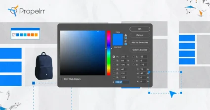
Table of Contents
There’s a certain science behind colors that convince customers to buy what you have to offer— welcome to color psychology.
Color psychology is defined as “the study of how certain colors impact human behavior.” Think of it this way: why is it that the color blue signifies calmness, or why getting angry is otherwise called “seeing red”?
It could be attributed to humans just being awestruck at what is being perceived. One could also argue that humans just want to express themselves through something universal, something that could not possibly be lost in translation. In fact, color therapy was also developed as a means for Carl Jung’s patients to better understand themselves and their problems.
Whatever the case, color psychology was developed to help humans make sense of color. Many artists are acutely aware of the effects certain colors have on their audience, and use colors strategically to evoke certain emotions. The best marketing strategies involve artists and designers who can utilize colors to really drive the marketing message home.
Web design and development is no exception.
Color psychology in web design
Color psychology is an important aspect of promoting a product. Different design elements rely on having certain colors take the main stage. For example, red is typically associated with passion, energy or even urgency. Orange gives off a more playful vibe, while calm can be represented by yellow, green or light blue.
It’s the effective use of these colors that can give promotional ads that extra bite that they need to deliver the message. You aren’t just limited to using one color, either. You can explore mixing colors to make your design even better or leverage color psycholoy to increase conversions.
It’s the reason why fast food chains love using red and yellow so much. Not only that, they’ve been using the same color scheme for years in a bid to influence people to associate red and yellow with comfort food. There have been changes to that formula, though, as Subway uses green and yellow instead to signify their comfort food as healthy and natural.
It may also be well worth your time to consider different color schemes and other web development trends in your design kit. For instance, dark mode has become more popular with users recently. Your usual color scheme won’t work as well in dark mode. You also have to consider cross-platform compatibility of your color scheme. That is, will it work the same on Android or on iOS as it does on PC? Don’t be afraid to experiment with color!
Understanding color psychology for web design
Fast food isn’t the only area where color psychology works. If you can unlock the full potential of the color wheel and use it to your advantage, you can just about get anywhere with your design plan. You have to remember that each color represents different emotions, but mixing them around can make your brand resonate with your customers.
Here are some noteworthy examples from ecommerce sites:
1. Nintendo Switch eShop
The default color combination of the Nintendo Switch controllers are red and blue. In video games, these two colors are used to identify who is Player 1 and who is Player 2. You can already see Nintendo going out of its way to show that its most recent console wants you to engage your friends and play together on the same device.
The eShop, however, is where color psychology invites players to buy the games they want to play. Both the menus and loading screens on the eShop are in different shades of orange. Orange is typically associated with fun and vibrant energy, the type of emotions you’d want to feel when playing video games or with toys.
2. Victoria’s Secret
Victoria’s Secret primarily employs two main colors in different shades: pink and purple. Pink is normally associated with femininity. On the other hand, purple is typically associated with luxury. Combining these two implies a luxury brand for women, which Victoria’s Secret is known for.
That’s not to mention a lot of their products are also of the same base colors. The heavy emphasis on pink and purple is the reason why Victoria’s Secret is regarded as a top brand for women. It’s this dedication to the color scheme that you should consider part of your e-commerce platform moving forward.
3. Apple
Apple’s most well-known colors are black, white, and gray. They’re all very traditional colors for a tech company. Apple, however, was one of the first to truly make it theirs.
In most settings, black signifies elegance and sophistication. White can be used to mean many things, such as minimalism. With Apple, it signifies thinking in the extremes with that gray area being the middle ground. You can see that in the philosophy that Apple has with its products, especially during the Steve Jobs era.
4. Subway
Subway likes to promote itself as a healthier alternative to most comfort food brands. Instead of the tried and true “red and yellow” format, Subway uses green and yellow, as if to say it is healthy but just as comforting as other fast food joints. You don’t even need to look at the box to say the food is fresh - you’re already thinking it because the box is green!
Whether it is the battle-tested formula of bigger brands or a deviation from it, you can use similar design strategies to promote products on your e-commerce platform. Like Subway, your platform can use a color palette composed mainly of earthy colors to reinforce the idea that your options are healthy and natural.
Tips for integrating color psychology in ecommerce design
Feeling inspired? Before you start painting over your web page, here are some tips to get you started:
1. Experiment with color combinations.
Find out which colors work best for you, but particularly with each other. Take some notes with this crash course on color theory to see how and why different colors can bring out the best in an image.
You can even have a monochromatic color scheme, with different shades and hues of your base color creating the color variety for you.
2. Keep it consistent to your branding.
Make sure the colors you use won’t clash with your branding. That includes your company’s image, name, and logo. Especially the logo. SEO company Reboot reports that 78% of consumers recall the primary color of a company’s logo but only 43% remember the company’s name.
As much as possible, you want your customers to remember every major detail about you. So keep your colors consistent with the identity that you want to build. If that means changing your logo to create that identity, so be it. Just keep it consistent.
3. Keep a palette of colors.
Just have different shades and hues of your main colors on hand. It helps that you have a variety of colors for your promotional ads while keeping your brand identity intact.
4. Keep it simple.
Looking at too many colors can be a turnoff for most people. Adding too many colors to a web page can overload the brain and lead your customers elsewhere. Other times, it may just be too painful to look at especially when the colors start clashing with each other.
Instead, what you want to do is to rely on your brand’s main colors and start designing from there. You can even keep the background in neutral color and then just add spats of color on smaller things, like icons or buttons. Again, you might also want to consider adding a dark mode for some users.
5. Run split testing with your audience.
A/B testing (or split testing) your new designs are crucial for your e-commerce platform. They can determine how effective a simple redesign can be (say, changing the checkout button from red to green). It could make the difference between a conversion and no conversion.
Propelrr’s A/B testing guide can help you run a smooth test run for your design plans.
Key takeaways
One final word before you start those color gears turning: Just keep it simple. You don’t have to go all rainbow on your e-commerce platform, unless it’s really part of your branding. But even then, use colors sparingly. You don’t want to overload your users with a myriad of colors. That being said, here are three key takeaways from this article:
- Explore color theory. This helps you identify which colors work well with each other. Color combinations can tell a subtle story that resonates with your consumers.
- Experiment with different hues and shades. Making a color lighter or darker can also create a story, especially if that color has had a storied history with your brand.
- Understand color psychology deeper. The better you are at understanding how colors elicit responses from people, the better your marketing will be. Find more resources on color psychology and learn more.
If you’re interested in creating a colorful yet powerful e-commerce platform, don’t hesitate to reach out to Propelrr. We’d be happy to help you elevate your brand to the next level! Just send us a note through our Facebook, X or LinkedIn accounts.
Want to get insider tips on how to diversify your marketing strategies? Subscribe to our newsletter and we’ll deliver it straight to your inbox.