7 Expert Data Visualization Tips for Digital Marketers
Author & Editor
Co-Creatives Team Lead
Published on: Mar 26, 2021 Updated on: May 28, 2024
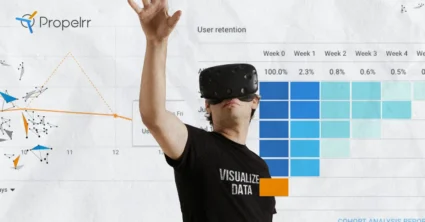
Table of Contents
Tell better stories with your data with the help of these data visualization tips.
The digital marketing landscape has changed. From content, the greater emphasis is now on data. No longer is it enough to just be able to churn out all kinds of content. Rather, it has become equally critical to generate data from your content.
Why? Because understanding data enables you to create better, more results-oriented strategies. However, as raw statistics and numbers, data in themselves can be very hard to understand and relate to. This is why data visualization matters.
In this article, we asked our Creatives Team to put together everything you need to know about data visualization. Below is a glimpse of what will be covered:
What is data visualization and why is it important?
Data visualization is the representation of any form of data in a visual format such as a graph or a chart. It aims to make complex information simple and understandable.
Ultimately, it’s supposed to aid the decision-making process of an organization, primarily because it easily spots these crucial factors:
1. Relationships between variables
When you see strategies and results laid out in a visual format, it’s far easier to connect how one variable affects another, thereby allowing you to draw up reasonable action steps.
In the context of search optimization, you'll be able to confirm whether or not the use of certain keywords affects a site’s web traffic or rankings and if these keywords are worth retaining in your strategies.
2. The performance of trends over time
The changes over a period are easily observable when they are presented in a graph or a chart. For instance, in social media engagement, you might learn that more active users are liking and commenting during a certain time of the day than at any other time. With this insight on trends, you can make informed decisions when planning or tweaking your marketing tactics.
Beyond identifying these crucial aspects, data visualization can help you communicate with your stakeholders. How?
Numbers, when presented in a visual format, can tell a story.
Visualization, in this sense, can help narrate the success or failure of a strategy. It can grab interest, which is why visuals can reign supreme in content marketing.
With data visualization presentation, it's much simpler to convince your team to adopt a new strategy or make adjustments to the existing one. The rationale behind your tactics will stick to their minds -- long after your huddle sessions – simply because visuals are vivid.
What is considered good data visualization?
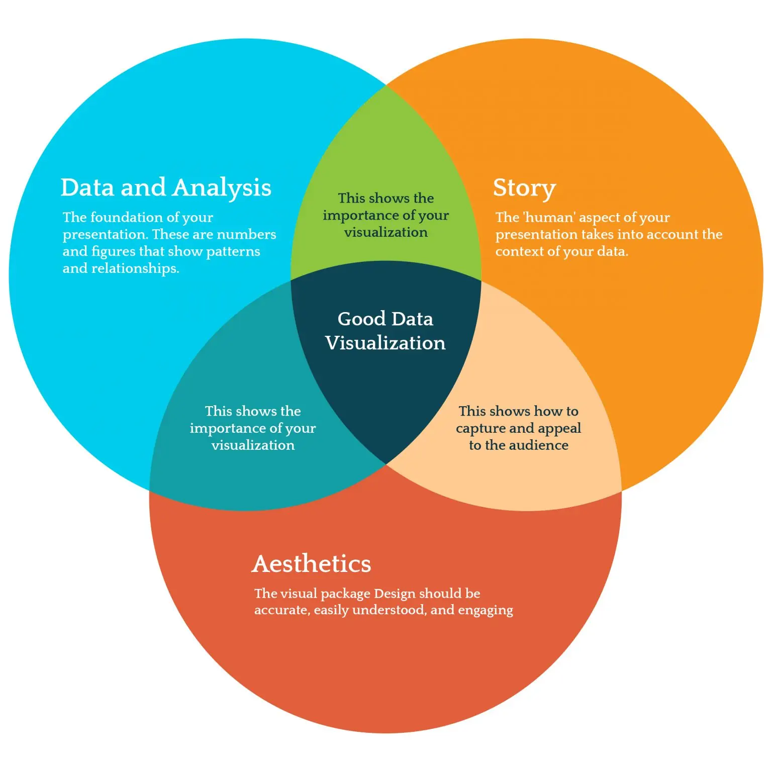
In a nutshell, the anatomy of good data visualization consists of analysis, story, and aesthetics. Here’s a breakdown of each:
1. Analysis
This constitutes the bulk and the foundation of your data visualization presentation. Your analysis of numbers and figures should help establish patterns and relationships.
In terms of patterns, you must be able to observe movements that emerge over a period of time or across space. A common example of this is steadily increasing web traffic from a certain location.
Meanwhile, in terms of relationships, look for positive correlations (both variables moving in the same direction) and negative correlations (one variable increases, as the other decreases, and vice-versa). These two must be present in your data visualization because they can provide the clarity your audience needs.2
2. Story
This humanizes your data visualization presentation.
Remember that behind those numbers and figures, there are people involved. Your data visualization ideas should take into consideration the social and cultural contexts of these people.
A steadily increasing traffic to a product page from a certain location, for instance, may indicate high awareness and strong interest from a specific community.
3. Aesthetics
This packages your data visualization presentation in an engaging way.
What’s most important to remember is that the design itself should be accurate and understandable. It should correctly reflect what the numbers say and communicate the data in a simple manner.
Alternately, it shouldn’t be a distraction from your analysis and story (more on this below). All the same, data visualization design shouldn’t take a backseat, since it’s the element that captures the attention of the audience.
Which data visualization techniques are used?
Previously, data visualization ideas include tables, line and bar graphs, and pie charts. But as the information we can gather became more complex with sophisticated technologies, the ways to visualize data had to evolve, as well.
Below are some common techniques used today:
1. Area chart
A variation on the basic line graph, this kind of data visualization chart features a shaded area below the line to demonstrate the total value of each data point. When there's a series of data compared, the area charts are stacked on top of one another.
Using this technique works best when showing the changes in one or more quantities over time. This can be handy in analyzing and presenting your backlink profile over a certain period.
2. Infographics
This representation of data information provides an overview of a certain subject. Using this technique works best when you have to explain different layers of a specific topic, say, findings of a survey or research or insights from a long report.
3. Heatmap
This type of data visualization uses variations of color to represent different values. Using this technique works best when presenting patterns of certain behaviors such as observing clicks on a webpage. The more clicks there are, the brighter a section will be. The fewer clicks there are, the duller the color becomes.
4. Histogram
This type of data visualization shows the distribution of data over a certain period. It uses bars to assign numeric values to variables. The bar's height indicates the frequency of data points.
Using this technique works best when you’re dealing with data with a continuous component like your social media engagements. Compile all data points of each day of the week for a month. Then, using a histogram, you’ll see which days had your greatest and fewest number of engagements.
5. Waterfall chart
This type of data visualization shows the cumulative effect in certain variables. Using this technique works best when demonstrating how a value has increased or decreased over time. Use the waterfall chart when showing your ad spending and revenue.
What are some data visualization best practices?
In a nutshell, these best practices are similar to creating visual content on social media. Use the following tips to create more effective data visualization presentations:
1. Know the reason for the data.
Right off the bat, your goal should be clear. This will guide all your decisions on how to visualize data best, including what information you should look at, to which kind of representation you should use.
If you want to convince decision-makers to increase the budget of your social media campaign, consider using an area chart to demonstrate the downward trend of your engagements lately and a waterfall chart that predicts the increase in page likes when you boost your ad spending.
2. Create a story for your data.
As mentioned above, real people are behind those numbers and figures. Putting them forward will help you create a compelling story. As such, start exploring narratives related to your audience.
Ask the right questions:
- Who are they?
- What can you infer from the behaviors they’re exhibiting? (Based on their demographic and psychographic profile)
- What challenges keep them from proceeding to your desired behavior as a marketer?
These questions would help the people looking at your data appreciate the recommendations you’ll have for them in the future. So tell a compelling story when you present your data visualization.
3. Keep the design simple.
Data, in itself, are complex. The goal of your data visualization design is to make the numbers easy to understand. This entails simplicity in design. Stick to a “clean” color palette with no more than five distinct colors.
Choose a neat background, too. Too many hues on the visuals can look cluttered and, therefore, distracting.
The biggest mistake you can commit in this context is to let the data become distorted because of aesthetics. Remember, form follows function. Don’t miss the core purpose of the data visualization presentation in favor of a flashy design.
4. Cluster, don’t clutter.
Particularly with infographics in which you discuss a lot of insights on a particular topic, group similar findings to avoid disorganization or cognitive clutter, so to speak.
On the flip side, beware of visual clutter, too. Use negative space to make your texts more readable and give the eyes some visual rest.
Colors should be well-organized because they’re often the biggest culprit to clutter. Below are some tips on how to incorporate hues in your data visualization design:
- Apply the same color for the same variables.
- Use light colors for low numerical values and dark colors for high values.
- Choose complementary colors for values dependent on each other such as those with cause-and-effect relationships.
- Go for familiar hues. In fact, stick to your brand colors if you’re presenting to decision-makers in your company.
5. Place proper labels.
It goes without saying that variables must be correctly named in your data visualization design. Likewise, include legends that indicate the scope of your data (e.g. month-on-month, quarter-on-quarter, year-on-year, etc.)
If necessary, add captions that provide more important information that can't be graphically depicted. Include where and when the data were collected. Provide a brief summary of how the information was gathered. This will not just help people better understand the context of the data information but also strengthen its credibility.
6. Highlight important data points.
While data visuals simplify complex findings, you can make your presentation easier to understand by drawing attention to the highlights of your story. For example, you can use symbols such as reference lines or bands on the peaks or dips of your findings, to direct the viewer’s focus.
Another way to emphasize important points in your data visualization is to apply the principle of visual hierarchy. The eyes naturally go for elements that stand out.
If you want a specific insight in the infographic to be read first, use bigger font sizes or striking, bold colors. Those that are less important or supporting insights would do well in small font sizes and softer hues.
With the important insights highlighted, you can provide a rationale for encouraging a particular action step.
7. Make sure that the graphics are readable in all formats.
Consider the technology through which your data visualization will be presented. In general, it must be compatible with computers and mobile devices. It's best to use Cascading Style Sheets (CSS) to make sure your graphics maintain their quality on any platform. Consequently, optimize your graphics right off the bat.
The use of white background is also wise, not only in terms of aesthetics but also in terms of functionality. White provides a sharp contrast to the hues you'll use in the elements of the visuals, allowing people to read the data easily.
What are some examples of bad data visualization?
Below are some common mistakes you should watch out for when designing your data visualization:
Choosing the wrong data visualization technique
With so many options available for visuals, it’s not unusual for people to be confused about which one to use. In the end, they use the wrong visual. At best, you’ll realize that the data points don’t fit in the graph or chart you chose. At worst, you won’t be able to tell the story you want to convey in the visuals.
Remember, different graphs and charts work best for different types of data. The best way to know which one to use is to consider what type of information you’re presenting.
In general, qualitative data are best presented in infographics, pie charts, and bar graphs. While charts and histograms suit quantitative data best.
Giving too much data information
In data visualization, you want to include as much information as possible to give the audience a complete picture and narrative. But in doing so, people sometimes make the mistake of providing too many pieces of information that are often unnecessary. This makes the representations look cluttered—so much so that it loses its core purpose of making numbers easy to understand.
One way to know if you’re overinforming your audience is when you use more than six colors in your visual. If you also need several text boxes to explain what the data points are, there’s a good chance there are too much data. Break these down into smaller clusters. Or, better yet, rethink your variables. Include only what’s necessary.
Key Takeaways
Data visualization is a crucial part of digital marketing initiatives. It provides a science-backed reason for retaining, changing, or replacing strategies. As such, every professional must learn both the science and the art behind it.
The key takeaways focus on the three aspects of data visualization (analysis, story, and design):
- Choose the right technique. Again, certain charts or graphs work best for certain types of data information. Consider carefully what you’ll use; so you can bring about an insightful analysis of the numbers and figures.
- Create a compelling story. Remember that numbers are influenced by people who are affected by their social and cultural contexts. Explore their narrative to make better sense of the data information.
- Curate an aesthetically pleasing design. Keep it simple, uncluttered, and readable.
These three components are the ingredients to an effective data visualization. With insightful analysis, a compelling story, and an aesthetically pleasing design, you can almost guarantee that your visuals can communicate clearly to stakeholders, even without much verbal explanation.
Do you want to share your take on data visualization? Share your comment below, or talk to us on Facebook, X, or LinkedIn.