11 Web Design Fonts That Will Give Your Website a Fresh Face
Author & Editor
Co-Creatives Team Lead
Published on: Feb 2, 2023 Updated on: May 17, 2024
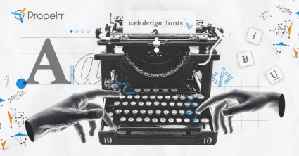
Table of Contents
Web design fonts seem like a small aspect of your business website but, in truth, they have much impact on conversions.
What separates “super” from the ordinary? As one blue, big-headed movie character exclaims, “Presentation!”
When designing a web page, looks play a big role in the grand scheme of things. Let’s say you may have an interesting piece that your audience might appreciate. If your presentation is meh or downright atrocious, you might just push that audience away. Far, far away.
Fortunately, web design and development need not be difficult. You need to make your web page appealing, and really reel your audience in. That’s how you create a wonderful experience for your users. In particular, your choice of font can influence whether a reader stays or leaves your web page.
Feel free to use these fonts for your web page design, and reach your maximum potential. Hopefully you can get a general idea of which fonts to choose and why they are so powerful for online reach.
How to choose web design fonts
Your web page has a definite and unique look. How texts are displayed on that look is key to your success. Keep in mind, however, that you can improve that success based on these six factors:
1. Legibility and readability
Legibility is how easily your users can distinguish between characters. If your reader has trouble determining whether a character is “S” of “5”, then you might have to choose a different font. Some fonts provide different shapes for similar characters (like “1”, capital “I”, and lowercase “l”) in order to distinguish them from each other.
Legibility can be influenced by other factors, such as choices of foreground and background color, font size, and font weight. For example, some letters may be more legible when you increase the font size, but is it readable?
In that regard, legibility is different from readability.
Readability is how comfortable a reader is with reading blocks of text. That level of comfort is also influenced by your text’s legibility. If a word is too small to distinguish the letters from each other, the word may not be readable. This is also the case in a dense block of legal “fine print” where one can read the entire text, but not as comfortably as they would have liked.
2. Brand consistency
You need to keep your presentation consistent. While your brand voice provides a strong foundation for your web page, keeping the same identity throughout establishes how serious you are at driving your point across. Your presentation is all aimed towards telling a particular story, and you’re inviting customers to identify with and acknowledge that story.
Find fonts that keep the narrative in place. If you’re looking for a professional tone, use professional-looking fonts. For engaging and friendly content, use fonts that feel comfortable to look at. You can find one that just about fits the bill if you look hard enough.
3. Mood and tone
Font psychology is the study of how fonts impact how your audience perceives your content. Some fonts have been traditionally used for specific purposes, and people have gotten used to that. Other fonts just simply evoke certain thoughts and emotions from their readers. In any case, you might want to use a font that helps bring your reader to the mood that you want to establish.
You can play around with fonts to establish that mood. Some fonts, for example, are more effective for headers than they are as body text. Mixing and matching fonts can even create a more dramatic feel for your content, and bring out more powerful emotions.
4. Web accessibility guidelines
Your website has to be inclusive to all visitors. It ensures that those who experience difficulties or limitations are still welcome to your website in the same manner as everyone else. It’s not merely a tool to generate more traffic to your business, but it encourages a community among all of your consumers.
To do this, designers often use guidelines to improve web accessibility to their sites. These rules and guidelines make content more user-friendly and easy-to-understand for all visitors. While not required at this point in time, improving web accessibility is a good way to establish rapport with your consumer base, and shows them that you care and want them to be a part of what you are building. The four main standards are:
- Perceivable. Simply put, your consumers must understand your content. It’s also not just limited to “seeing” the content, either. Bear in mind that users who are blind or have low vision use alternative screen reader software to help them navigate the Internet. Consider these users when you set your web page.
- Operable. This means that all users can access and operate all parts of your web page (text, links, audio, video, other media). Generally, most operable websites are simple and, thus, easy to navigate.
- Understandable. Your users must be able to digest all the information you are saying. You could use a common language, or offer alternative languages. Similarly, your website’s navigation must be organized intuitively and naturally to help users understand you and your product.
- Robust. The content on your website should be easily broken down and parsed by assistive programs like screen readers. That way, people with difficulties will still be part of the experience that your website provides.
RECOMMENDED READING: Web Design Concepts That Prioritize Customer Centricity
5. Cross-browser compatibility
You have to consider that some users just straight-up don’t want to use popular web browsers like Chrome or Mozilla (for one reason or another). In some cases, these alternative browsers use substitute fonts, like Arial or Times New Roman, to display your text. Use a font face that can be displayed properly by most, if not all, browsers.
The four font formats supported by websites are:
- Embedded Open Type (EOT). Supported only by Microsoft browsers (Internet Explorer and Microsoft Edge)
- True Type Font/Open Type Font (TTF/OTF). Founded by Apple and Microsoft in the 1980s, these formats are supported by all major browsers, namely Chrome, Firefox, Opera, Microsoft Edge, and Internet Explorer
- Web Open Font Format (WOFF). Founded by Mozilla in 2009, this format is a compressed version of the TTF/OTF made to load faster
- Web Open Font Format (WOFF2). A revision to the earlier WOFF, its major players include Chrome, Firefox, and Opera; it is designed to replace WOFF and will do so eventually
Be aware that the most commonly used formats at this point in time are TTF/OTF and WOFF. Fonts that use these formats can be displayed correctly across all supported browsers.
6. Scalability
Have you ever noticed that some fonts just look better and smoother than others? These types of fonts are called scalable fonts. They are programmed to look the same no matter the size of the text. Some fonts aren’t programmed the same way, and the resulting text just looks cheaper and poorer in quality.
Why does scalability matter? It’s simple. Some people, mostly older users, just can’t read smaller texts. They have to zoom in real hard to be able to read what you want them to read. Choosing a scalable font enriches their experience with your web page, and it also makes them feel included as part of your audience.
Popular web design fonts
Now that you’ve covered the basics in choosing the best fonts for your web page, here are some popular fonts recommended by designers.
1. Open Sans
Open Sans is a “no-frills” kind of font. It’s straight and to-the-point, and doesn’t mess about with your message. Open Sans is also surprisingly very versatile. It looks formal, but it’s also given a “neutral, yet friendly appearance” by its designer.
It’s scalable, meaning you can read it in small and large text sizes. It is also optimized for print, web, and mobile interfaces.
You can see why Open Sans is commonly used online. In fact, more than 84 million websites use it in one way or another. Some of these websites include:
- Upwork
- Vana
- Atoll Digital
- Ssense Magazine
2. Roboto
Roboto is another popular font recommended by designers. It is a font face that’s rigid and geometric, while featuring “friendly and open curves”. Letters appear tighter to each other, making reading a bit more rhythmic.
Roboto’s family of fonts includes Roboto Condensed and Roboto Slab, making the entire Roboto family flexible. It is a font that can be used for just about anything, from titles, to headers, to plain old body text. In any case, it appears professional and friendly enough to put on your web page.
It’s no wonder that over 630 million websites, Google and YouTube included, use Roboto religiously.
3. Lato
Lato was originally designed as a professional font for a corporate website. Because the client went in a different direction, the font was released for public use. Letters look sleek and elegant, sort of like a rustic-themed handwritten letter.
It is also easy on the eyes, making Lato a serious contender for body text. It’s also very good in larger sizes, maintaining its unique characteristics as the text becomes larger.
Familiarity and warmth are also big themes in the font face. Lato (summer in Polish) was also designed with the feeling of summer in mind. It is rigid, but not too much, giving off a serious but comforting tone.
A good example of Lato’s use can be found in Bundl, a corporate venture site.
4. Helvetica
This one’s a classic. You might have heard of this one, and it has received a lot of mixed reception depending on where you ask. Regardless, Helvetica remains a solid font for web pages. It is a very flexible family of fonts, and you can have it in bold, condensed, or just have an ordinary typeface for your web page.
Helvetica was originally designed in 1957 to be a neutral font face, to be used just about anywhere. It has performed that role to a tee, quickly establishing itself as one of the Internet’s most popular fonts. The font makes words easier to read at distance, and is also perfect for headlines. It also remains legible and readable no matter the font size of your text.
Helvetica is also constantly evolving with the times because of its flexibility. Brands in different industries use Helvetica in one way or another, namely: BMW, Motorola, Nestlé, Microsoft, and Apple. Government authorities like NASA and the European Union also feature Helvetica.
5. Proxima Nova
Facebook’s former head of Design Cameron Moll published a piece on Proxima Nova’s history. He describes the font as “incredibly versatile for digital interfaces, performs like a workhorse at many different sizes, and looks remarkable on retina displays.”
Proxima Nova is a font face that was intended to capture the roundness of fonts like Futura and the geometry of fonts like Helvetica. It’s not unique in that regard, however, as other fonts also tried to do the same. Gotham was way more popular than Proxima Nova in the early 2000s. Moll argues that Proxima Nova’s early availability on the web catapulted its status as an iconic typeface.
Since then, it has become the most popular commercial font online.
6. Montserrat
The Montserrat font was inspired by the Brazilian neighborhood of the same name. It attempts to capture the vibe of Buenos Aires typography of old, and bring it to modern-day media. Because of this, Montserrat drives nostalgia and familiarity from its viewers. It sets a serious, yet friendly tone for all sorts of promotional materials.
Its popularity is owed to its scalability and, in turn, readability. Thus, its use is not only limited to online media, but also printed media such as brochures and books. The Mexican government’s graphic manual has also set the font as its standard for official media.
7. Raleway
Raleway is a stylish open-source font. That means, it’s free to use and can really stand its ground in any web design, particularly its unique “W”.
Designers like using Raleway because of its accessibility, and also because it combines well with other fonts. The font itself is readable and provides a welcoming appeal to readers. You can use Raleway for just about any project suited for a broad audience.
8. Source Sans Pro
Source Sans Pro is Adobe’s first open-source font family. It is designed to work particularly well with user interfaces. Its rounded shapes make the letters easy on the eyes, while maximizing spaces in between each character.
Source Sans Pro’s most notable quality is its legibility, and you can easily distinguish between similar characters by virtue of some stylistic design choice. At its core, Source Sans Pro is all about accessibility. It’s easy to read and professional in tone. Stanford University and Adobe use the font for its websites.
9. Poppins
If you’re looking for a solid and serious tone for your web page, Poppins might just be for you. The letters look strong and linear, and are as straightforward as you can get with a font.
As a result, you won’t have to worry about your text being scalable. It’s also really sleek and simple. It’s a solid choice for any web page.
Animation studio Wonderlust is among the 8.1 million websites using the font.
10. Georgia
Designed by Microsoft, Georgia is a font that is intended to be readable in digital format. It appears elegant and legible, even on low-resolution screens.
Its elegance is largely in part to its Roman-inspired design. However, that doesn’t stop characters from being legible at all. As a result, the reading experience feels balanced both on digital and on paper.
Microsoft regularly updates the font to give it a more modern and flexible appearance. The updated version, Georgia Pro, is available for purchase. However, Microsoft users can get the font for free on the Microsoft Store.
11. Playfair Display
Playfair Display reads like newsprint of the 18th century, not that it’s a bad thing. This font looks very fancy and establishes a very professional tone for your web page. It also makes for sophisticated reading and is surprisingly flexible. You can pair it up with other fonts to drive home that classy feel.
How to use web design fonts effectively
You’ve been given a list of fonts to use, and how to identify fonts for your needs. To use them effectively is an entirely different process. Here are some things to look out for when using fonts.
1. Font pairing and combination.
It’s not uncommon to see designers mix and match fonts for greater effect. Think of it as going through your wardrobe and making a plain white t-shirt stand out in one of your outfits. Or driving people’s eyes to those new kicks at your feet.
In the same vein, you can direct readers to certain points in your web page even if they aren’t eye-catching by themselves. You just have to structure everything else around it to make sure people really look into that specific spot.
That includes using different fonts for different purposes on the same web page, or something as simple as setting an aesthetic color scheme. Maximizing color psychology can even improve conversions on your web page.
2. Custom font creation.
If you’re creative enough, you can even create your own font for your own purposes! Some services, like Calligraphr, allow you to transform your own handwriting into a digital format. If you’re looking to make a font that others can use, just be aware that it is typically a long design process.
3. Licensing and usage rights.
Most fonts are free and can be used for a variety of purposes, be it personal or commercial. However, some font designers place limits on their creation’s usage. For example, you must pay the designer in order to use a font for commercial purposes.
4. Testing and optimization.
An important pre-release stage for any web page is testing and optimization. You have to double-check whether the text is displayed correctly and with the right font, whether the color scheme is pleasing to the eye, etc.
RECOMMENDED READING: How to Create a Seamless Web Design and Development Workflow
Setting up fonts for use on websites
Now that you have an idea of which fonts are commonly used online, you’re ready to start using them. Here’s how you can get started:
1. Download and install the fonts.
Some creative suites already have pre-installed fonts that are ready for use. However, if you find a font that you like is not part of your catalog, you can simply search for them online. You can also choose which format you want to download (e.g., whether you will use TTF/OTF, WOFF, or both).
Many open-source fonts are free to download, but some fonts have to be purchased before you use them for certain purposes. If you plan on using a font for commercial purposes, be sure to read on the font’s license terms before you do.
Once you find a font, just download it onto your computer. Most fonts will come in a .ZIP format, so you have to extract them. Just right-click on the file, and select “Extract Here” to do so. You’ll end up with a font file that’s ready to install.
Just double-click the file and then press “Install” on the preview screen that pops up.
2. Embed the fonts on your website.
If you plan on doing the work by yourself, you can browse different guides such as this one to see how you can embed the fonts using different web platforms.
Bear in mind that there is a web design checklist before you release your web page to the public.
3. Ensure cross-browser compatibility.
The more popular and commonly used fonts are already in TTF/OTF or WOFF versions, meaning they are displayed properly across all major browsers. However, you may encounter a custom font that doesn’t quite look as intended because it has a different format.
If you want to stick with a font, you can try some online guides and make your text cross-browser compatible. It is, however, recommended that you use fonts that have the aforementioned formats so your web design won’t be jeopardized.
Web font optimization tips
You may encounter problems with your web page’s loading times. In this day and age, long loading times are the bane of any person browsing the web. Your users and potential customers are no different. Here’s how you can avoid long loading times:
1. Don’t use too many fonts.
This one is pretty straightforward. Typically, the more custom fonts you use on your website means you’re slowing down your web hosting service.
The general rule of thumb in font usage is to stick to two font classes: one for your header and titles, and one for your body text. That way, you can avoid overloading your hosting service, and it’s less taxing for your design team. Your viewers might also be turned off if you change fonts frequently.
2. Use optimized fonts for each browser.
Unfortunately, no one format works in all browsers. You have to use different formats when creating a web page. With Google Analytics, you can check which browsers and devices are most popular with your visitors.
If you’re comfortable with older browsers using alternative fonts, you can always take shortcuts. But again, that’s not recommended.
Key takeaways
Now that the dust has settled, it’s time to set your creative juices to work. You are free to use the fonts on this list or explore the Internet for custom fonts better suited to your needs. In any case, here are three main takeaways from this article:
- Use a font consistent with your brand voice. It improves relations with your audience and sets the tone for new customers.
- Make your brand customer-centric. One important aspect of web design is that you are creating something for your users to enjoy; not just you.
- Don’t be afraid to experiment. That’s what the design process is for. You’re supposed to explore what works and what doesn’t.
Get in touch with Propelrr today to know more about web design concepts. We are more than happy to help you. If you need more help or more information, connect with us through Facebook, X, or LinkedIn.
For more tips on how to create user-centric websites and applications, make sure to subscribe to the Propelrr newsletter to get instant access.