Understanding the Role of Visual Design in UX Design
Author & Editor
Co-Creatives Team Lead
Published on: Nov 4, 2022 Updated on: May 22, 2024
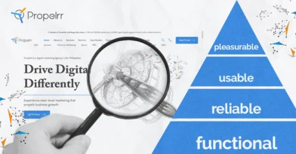
Table of Contents
After arriving at your website, visitors are first pulled in or turned off by the visuals of your user experience (UX) design.
Those are the potential consequences of your first impression. Where, on the one hand, visitors that are visually pleased keep browsing and even make a purchase. Or, on the other hand, are displeased by overwhelming visuals, close the page, and go to another website.
First impressions may not last, but they sure do matter in a digital world that is demanding and easily distracted. Hard work in promoting content, optimizing for search, and paying for ad placements could easily go down the drain just because of bad visual treatments in your UX design.
The role of visual design in UX design
The broader purpose of any form of design is to create experiences that ease the life of end-users.
In that sense, visual design and incorporating it in UX should synergistically work together to simplify the browsing experience of visitors. However, many designers will fail at doing this, because of tendencies to overdo or get lazy with the visual design, or UX, or both.
Anchoring the design goal on the fundamental purpose of design, and understanding some key elements of visuals, will help you avoid those situations.
Six key elements of visual design for UX design
Given the integral role of visual design in UX, let’s tackle the elements of what makes good visuals with insights from our digital marketing agency.
Consequently, you’ll also understand how these are combined to make a website understandable and functional.
- Lines. The most common element design, lines can be straight, crooked, continuous, broken, thick, or thin. These help convey stillness or movement in a design - especially for diagonal lines. They are also used to convey division and hierarchy within elements.
- Shapes. Apart from lines, it is equally common to utilize the use of shapes in graphic design. These can either be geometric - circles, squares, and triangles, or organic - the shape of food, leaves, and trees. Either way, shapes are used in visual design to add dimension and emphasize a certain area.
- Colors. Probably the most fun element to play with - colors! They establish the overall mood of your design, may it be a bluish calm or a fiery red. It can also be used to separate your layout into sections and highlight the elements you wish to emphasize.
- Typography. Typography conveys the mood of the text and directs their hierarchy. To be more in sync in relaying the message, font styles and sizes can be repetitive for identical parts of the design. But. while it may also be fun to play with fonts, you would want to be careful to use too many variations!
- Texture. Although usually overlooked, the texture of design also affects its overall look. It depicts how smooth or rough the overall layout feels. Textures add depth to your image if appropriately used to complement other elements.
- Space. It is easy to spot elements in a design, but it is also important to consider the lack of it - the negative space. The spacing below, above, or beside objects can contribute to the readability of your design. The strategic use of space can also help emphasize which images are significant.
Visual design principles
Aside from the elements, visual design principles will also help you understand the role played by visual elements in a website’s UX. These principles will help you achieve an effective design with a clear message.
- Emphasis. This pertains to identifying which elements are important to convey the message you want. Adjusting your design to convey hierarchy is necessary for users to easily identify your main idea.
- Balance and alignment. While there may be multiple points that you would want to emphasize all at once, it is still important to maintain balance in your design. This means that you cannot simply put all images in one area, there must be symmetry between what lies on either side of the page.
- Contrast. The main elements of your design should not blend with your background - there must be space and variation to achieve contrast between them. An effective use of contrast will mean that despite difference, your elements are in harmony with each other.
- Repetition. Not everything has to be different within your design. Oftentimes, there is repetition in elements and typography to put emphasis to the point you want to pass on.
- Proportion. To achieve balance, the size and weight of your elements must also be considered in relation to each other. Whether there are chunks or none, you should carefully place and resize your images to avoid having huge elements on one side and tiny images on the other.
- Movement. Behind every design is a story, and this can be told through anticipating the movements that your layout can make. This includes putting elements in such a way that the user's eyes will follow your narrative.
- White space. It is important to give your design a room to breathe through the use of white space, commonly known as negative space. Having a space with no element doesn’t always mean that your design is lacking, it can also help in organization and balance.
Impactful visuals compel actions
The impact of visual elements in achieving better UX and UI design, higher ranking on search result pages and overall business KPIs have been proven by various case studies conducted across different business areas. Are you up for it?
1. Music & Arts
With over 150 retail stores and more than 300 affiliate locations, Music & Arts has deemed a UX redesign project important for their musical instruments business.
A thorough case study of a three-month UX redesign project revealed a 30% increase in their online sales annually. Said redesign improved the website’s consistency, simplicity, user flow, and system feedback - leading to more sales generation for the business.
2. Continental Office B2B Website Redesign
Continental Office is a customized workplace solution provider who had a working website for six years prior to redesign, but had to update their UI/UX design to tell and understand the entirety of the customer journey.
This thrust proved to be one of the most strategic moves of the company, after a case study on the Continental Office B2B redesign revealed that building the website around their customers increased website traffic by 103% year-over year. Even their net-new contacts increased by a whooping 645%.
After the redesign, Marketing Vice President Rachel Iannarino was quick to realize, “In creating that great user experience, you have to stay relevant with what people are looking for and then build your website around that, which I believe is what we did and has allowed us to have these successful results.”
3. Jambb Social Platform by Finna Wang
A huge portion of content creators’ success comes from their fans, and Jambb Social Platform wanted to recognize and reward these fans for their unwavering support. To do this, they had to focus on their UX and UI Design.
A UX case study on Jambb revealed how the team learned through user testing that visual hierarchy was effective in getting their target users’ attention. With this information, they designed various symbols reused in the website that included signature typography, colors, and buttons. The team also plans to re-think the design of their pages once they integrate the website with other social media platforms.
Should you always prioritize visual design over UX design?
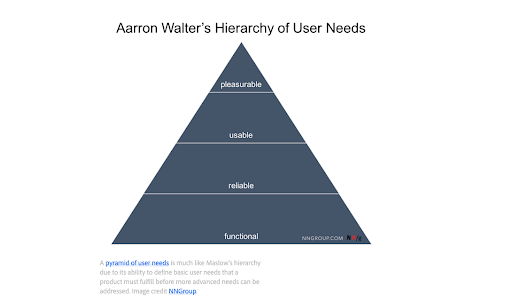
By now, you should have probably understood the importance and impact of a good visual design to the UI/UX of a website. But while visual design principles must be heavily considered, it should not be the top priority in UX design. In fact, it is in the last level of Aaron Walter’s hierarchy of user needs.
Again, the end goal of UX and UI design is still to make the lives of the users easier. This means that they must still be able to access and navigate your website with clarity and ease. A good design will be of no use if your website or application doesn’t achieve these.
Tips for improving your visual design in UX design
With all the visual design principles and elements you have to remember, it is perfectly acceptable to find your way first. Let these simple yet effective tips help you!
- Create emphasis. Your target user will only spend a few minutes on your website before they decide to purchase or close the window. So, you must highlight images and elements that you think will speak to them best.
- Stay consistent. It is easy to get distracted with creativity, but it is also important to stick with your branding. Be consistent with your colors, typography, and logo to instill a better recall to your audience.
- Think like your end user. Your users would want to feel control when browsing your website, so keep this in mind when thinking about the UX and UI design of one. Put yourselves in their shoes and design your page in a way that can solve their queries and problems.
Key takeaways
Visuals in UX and UI Design can be extremely impactful, just make sure that you have the right combination of elements that follow even the most basic principles. The goal is to make your visual design in UX complement your content. To achieve this, here’s what you should remember:
- Go back to the basics. Do not be overconfident that you already know everything about how design works. There is beauty in simplicity. Always check your foundation and revisit even the most basic principles.
- Design makes wonders. Your website’s visuals can either make or break the UX and UI design of your page. Make sure your website has what it takes to be effective and still stand out from the rest!
- Visuals are important, but not the top priority. Always remember that your end goal is to make your viewers' lives easier through your website or application. Good visual design doesn’t guarantee a good UI/UX. You still have to prioritize what your audience needs and wants.
Have you maximized the role of visuals in your UX and UI Design yet? Share what you’ve got with us on Facebook, X, or LinkedIn! We’re excited to unleash more of that creativity!