10 Simple yet Overlooked UI Elements to Improve Usability
Author & Editor
Senior Software Engineer
Published on: Oct 19, 2022 Updated on: May 22, 2024
Table of Contents
Improving usability often doesn't involve snazzy user interface (UI) elements.
The user interface (UI) elements listed here are critical to your business website's user experience (UX) design. The key reason is that: they greatly improve usability and not using them is just plain laziness.
Most users don’t realize that they're having a hard time navigating a website; after all, how do you come to that conclusion when you're too busy trying to figure out what to do next? And that's not your user's fault, but that of your UX designers.
Those who presume that users will immediately know what to do on your applications and websites, that is. The ones that do the kind of lazy work that doesn't account for how clueless we can all actually be when faced with simple or complex instructions.
In fact, most of us don't even bother reading through everything on a web page. An interesting observation that was pointed out by Steve Krug who once said in his book 'Don’t Make Me Think':
On Steve Krug’s book, “Don’t Make Me think”, he stated that:
“One of the very few well-documented facts about Web use is that people tend to spend very little time reading most Web pages. Instead, we scan (or skim) them, looking for words or phrases that catch our eye.”
Steve Krug, user experience professional
So, in designing experiences that respond to that, you'll have to account for just how reactively the human brain functions.
UI/UX design and your reactive brain
Our brain functions in a way that it only allows one action after another. It uses our senses to determine the next logical step to take. This is the only true way we maneuver our current environment; your brain – believe it or not – is hard-wired to get to a process's end.
That being said, setting up your UI should make the next action easy to identify for your users. It should lead the way for interaction or conversions with every call-to-action (CTA) and copy.
READ ALSO: Direct Response Copywriting for Websites – How Now Wows!
There are tons of things on a website that are starkly noticeable. Yet, users tend to not use it properly. Because, let's face it, user experience is subjective and it depends on individual behaviors, patterns, and intent.
So don't think that you'll bruise a few egos when you're basically saying "duh" with your user interface and design. In fact, contrary to the negative effect you fear, doing so improves your app or website usability in a way that impresses your users and/or visitors.
If you're not sure what specific elements these are, then read on.
The UI elements you can't do without
There are many things you can do in UI and UX design. Most of them are flashy and nice to have. But often, they are just veneers that distract your users from accomplishing their purpose.
To help you narrow it down to the most helpful elements, I carefully analyzed countless websites and tried using them at the most basic and quintessential level. The result is crisp list of 12 often-ignored elements that help make website navigation “instinctive”.
NOTE: I list them in order of importance instead of how irritating a page is when it’s not there.
1. Click out function or an obvious close button for modal views and pop-ups
This item is the first to be called out because of the level of frustration this “error” causes.
If you're on the web, often, then you've already encountered pop-ups. And man, are they popular. Some of you encounter these as welcome messages. Most will see a pop-up that's already trying to get you to buy with the help of a coupon or promotion.
I'm sure the lot of you have whispered begrudgingly, “Hey! I just arrived and you're already trying to close a sale? Come on. How about a bit of convincing, first?” Your immediate next action is to close it and move on.
The pop-up did not serve the purpose it was intended for.
To back this up with science, a study by the Nielsen Norman Group reveals that pop-ups top the list of most hated advertising techniques. But that's not to say that you should completely do away with them. You will hate it, but giving your visitors the clear and immediate option to close that pop-up will serve you better.
And don't make those “close” buttons microscopic. That costs users time to find it and annoys them further. Strive to make them visible, and make the user's choice of action easy to accomplish so they can, as we said, move on to browse your website.
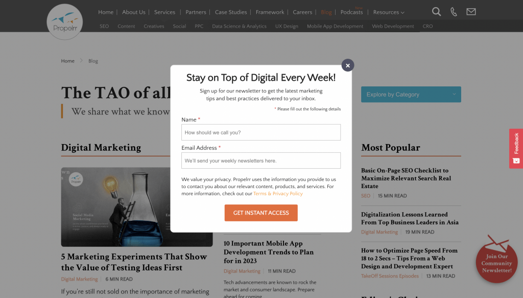
Another way you can improve the usability and overall experience of your website is by carefully considering the triggers for the pop-up. Does it really serve you or your visitor to have the pop-up show immediately upon entrance? Or would it be more intuitive if it shows up after a visitor finishes scrolling through a product page?
The latter would be the better option to go for if you want to improve landing page conversions.
2. Return/Back to top button
Long-form content is a known technique to get top ranks on search engine results pages. These are pages that house more than a thousand words created to rank for multiple keywords at a time.
They're in-depth, informative, and just enriching. But scrolling down through this content, and then back up makes me feel like I aged a day.
Now, before you get all clever by saying "there's a home button on your keyboard that does that," let me reference what we said earlier about not assuming that the user knows all the shortcuts. So instead of assumptions and arguments, it's much better to just give them an option to quick-scroll upwards.
It’s not even underestimating the user’s capabilities; it’s the placement of a “back to top” button makes it more a “no-brainer” scenario.
It’s like having someone say, “Hey are you done here and going home? Let me call a cab for you." Who doesn’t want that? With that, there's no reason to not have it as part of your UI.
3. Arrows
Ah, the humble arrow. Pointing us to the right direction since who knows when. These are small visual hints that are at times may or may not be click-able. Regardless, they serve their purpose. I’m not really sure why some leave this out, maybe because sometimes it’s ugly, sometimes it’s like making the user look dumb.
All of these things, they are not even close to a good reason. Arrows tell a user where to go. Or in the case of pages or image slides, it tells you that you can browse left or right, back or forward. It immediately tells you: “There’s more content here”.
It’s a dynamic behavior, but the arrows make it streamlined. There are pages where it says “Find out more”, or “There’s more.” But the question it doesn't answer is, “Where?”
A classic example are arrows that help users identify where more content is located. Some will argue that it doesn’t matter, they will use it anyway. That is also true. And what is also true is that everybody knows what arrows are and will definitely figure out what it tells them.
Additionally, a simple arrow can provide a 76% chance that the user would click through the items again, especially on mobile ecommerce, higher than its other counterparts.
4. Sticky menu or navigation
Google, Facebook, X. These are one of the most visited and most functional sites on the internet, and they have a common thread among them. It's the sticky top bar. Because these websites present long pages that are updated in realtime, they are aware that it will be a drag (pun intended) to scroll all the way up just to hit that function that’s included in the top bar.
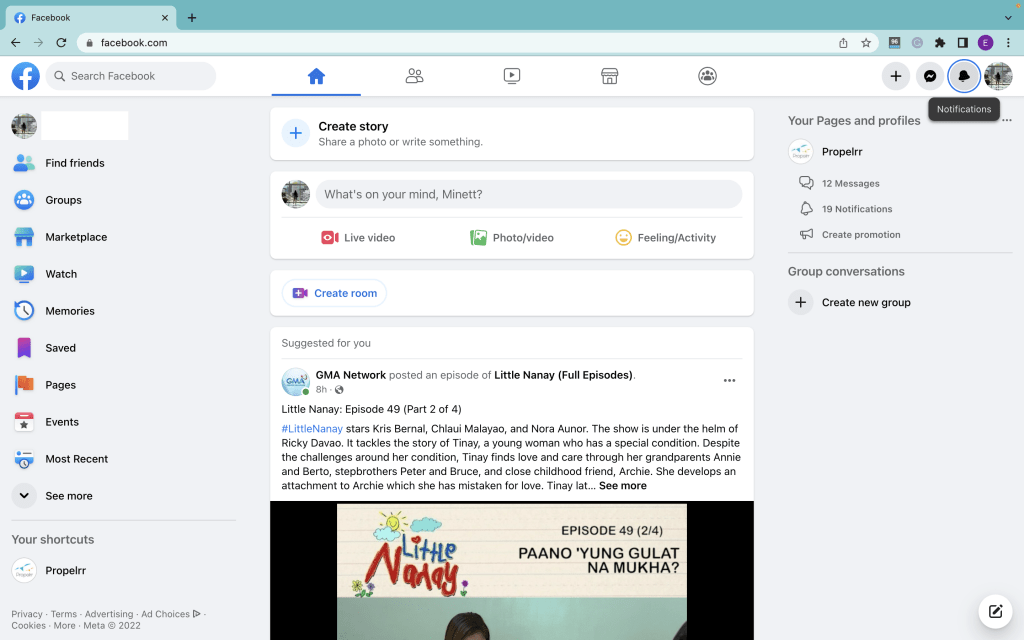
It is proven, sticky menus are quicker to navigate. This simple solution is so effective, it actually reduces navigation times by 22%.
What's more, this feature is not hard to do or disruptive. And if you need your customers to skim through your valuable pages, it's a non-negotiable. It reduces the steps required to go to the next function.
5. The “You Are Here” Indicator
Not everyone gets to enter your website from the front door. Some will land on specific pages, like the story page for this specific article you're reading.
But if, say, I want you to know exactly where you are so you can then decide where you want to go next, how would you know that apart from the huge headlines and the URL?
To that, I answer subtle "You Are Here" indicators which can be seen in the form of a highlighted text on the sticky top bar. Take a look at the image below.
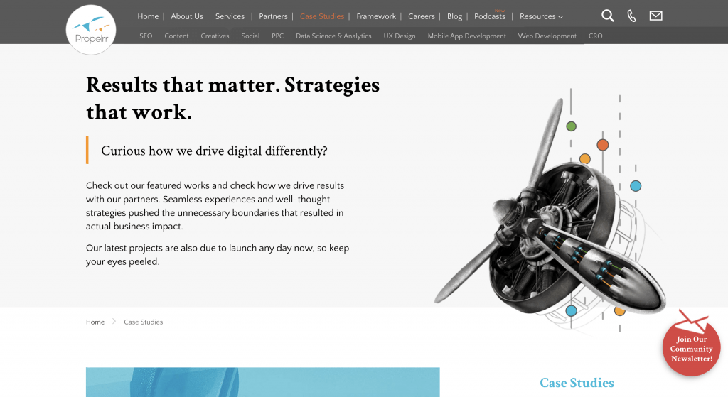
Treat website navigation like a GPS – it is more useful when you know where you are before you start going in another direction. Implementing this requires just simple codes that run color, size, weight, or other changes in texts. Whichever way you choose, just make sure that it breaks the consistency from inactive pages or menus.
Combined with a sticky page navigation bar, you provide users with a dashboard that improves the level of ease with which they can move around your website.
6. Secondary navigation
Before you forget, users scan pages. They don't take much time to read things.
That said, they are also quick to leave if they don’t find what they're searching for right away. This is a problem especially if you had the information they were looking for in the first place – and, hiding in plain sight, too.
If you're handling huge websites like commerce sites, for example, that means you have hundreds to thousands of product pages for users to mine into. The volume alone is enough to confuse and give anyone a hard time, especially if without a secondary navigation option.
To avoid confusing and turning away your visitors, don’t try to cram everything in a single navigation bar. You’ll never get it right. Worse, even, if you resort to endless drop-down lists which, according to Jakob Nielsen are "often more trouble than they are worth and can be confusing." This is because UX designers use them for different goals. On top of that, scrolling these menus reduces usability and limit usability as users don't get a single-glance look at the entire selection.
When implementing a secondary nav, don’t forget to integrate the other small UI elements written here, like the "you are here" indicators we mentioned above. Secondary nav helps in categorization – effectively organizing your website content for easier appreciation.
On top of categories, secondary navs make your UI more focused, as it is naturally separated from the main nav. It’s like having an index that points you to a specific area or section where a text or item is found.
7. Breadcrumbs
You may not need to implement breadcrumbs all the time, but if your website has tons of subcategories, you better have one.
Breadcrumbs are a kind of indicator that tells users what page in a subcategory they're currently at. Sounds familiar? Of course, because it's commonplace in most websites today. They're usually found just above the page title, and are clickable so that users can easily return to the previous category.
Take a look at how that is implemented on our article pages, below.
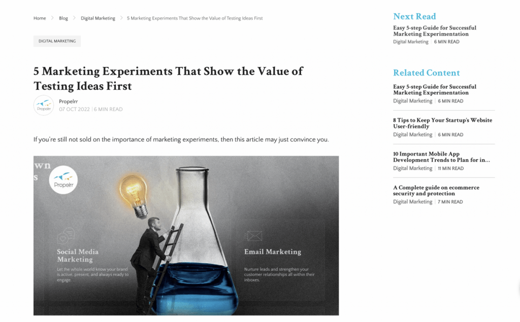
Now this may not sound like a big of a deal but seriously, people tend to forget or quickly get distracted. Sometimes, users need to be reminded that they are actually in a certain “level deep.” This means that they are inside something that is not in the scope of the main navigation.
Breadcrumbs are almost self-explanatory and it doesn't require tech savviness to use. Like all other usability-centered interfaces, it feels natural and intuitive. You don’t even need to explain what it does. Just leave it there and let it do its work.
On top of these, mobile optimization uses breadcrumbs to make pages easier to navigate on smaller screens. Don't neglect to incorporate them in your mobile layouts so that you get plus points from Google.
8. Search functionality
A search functionality is another underrated UI feature that is non-negotiable. Whether or not your website has a deep well of content, or pages, having a search bar is a necessity for modern websites.
That's because search is one of the most preferred methods for online interaction. Hence, having one on your website can help move transactions along much faster. As you make it easier for your frequent visitors to locate a specific product or piece of content, you lead them closer to a conversion.
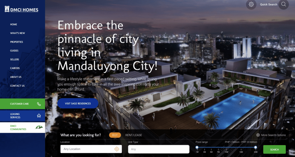
From the user-driven perspective, search functions are a must-have as it helps them save time. In fact, if you can give them advanced filters to make their searches as specific as possible, the more delighted they will be.
On the other hand, ecommerce, real estate, or other websites that have a deep catalogue that don't have search bars see far fewer transactions than those that do.
9. Link color
This is so obvious that it really cracks me up when I see it not implemented. I mean dude, seriously why wouldn't you do it? It's not like the code is hard to pull off, nor is it an intrusive feature.
In fact, more than being a distraction, it helps your readers find a related story or piece of content easier.
A line of text, when it’s meant to be “clicked”, must have some form of indicator. And that can be through an underscore, colored texts, or both. The question is what color to select? Do you go for the traditional blue that is often seen on Google's search results pages? Or do you go with something a little more on-brand?
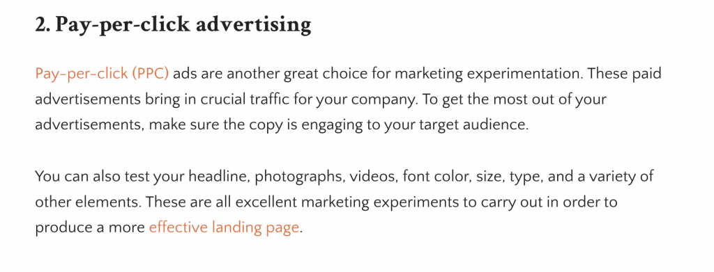
Regardless if it's blue or otherwise, always use contrast and establish a standardized method for presenting your “clickable” links. Never use a color you used for links for texts that don't have links anchored onto them.
10. Search suggestions and auto-fill
You know that feeling when you run a search and nothing turns up? Feels like it's the end of your tiny niche world, doesn't it?
Thank the universe for search suggestions, then.
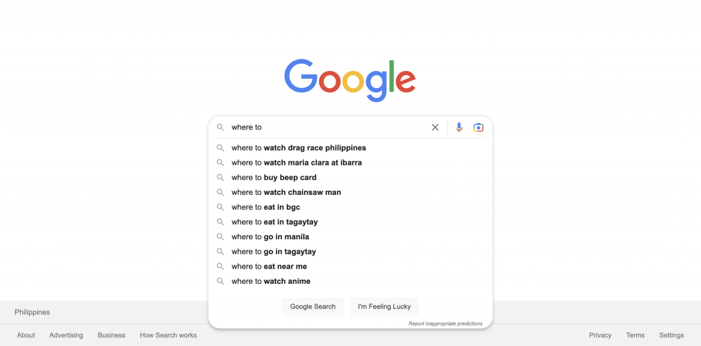
Thanks to Google's innovative autocomplete feature on search, this has become the norm for the functionality. Arguably, it's become an expectation for websites that incorporate the feature.
This results in shorter search and browsing times – improving the search experience in a totally different way, as it eliminates frustrations with inaccurate queries. Not only that, but it makes for a non-obtrusive way to PR your content by suggesting those that are highly relevant to your user's search.
Key takeaways
There you are, small but really effective UI elements you should not ignore. Always remember that there is no such thing as overly obvious in an overly distracted online world. Admittedly, we all could use more help in focusing; and if you can do that through your user interface, then your visitors will be glad for it. On top of these, remember that:
- You should be purposeful. Great user interface is meaningful, above all else. If a function is not serving an objective, then it's a distraction. Remember to keep it focused, and simple, rather than adding stuff just because you think it will look cool on your website.
- It's called "user" interface for a reason. And that reason is user-centricity. In any UI project, keep your audience at the forefront of your mind, so you are guided accordingly on how to make an experience that is helpful and meaningful to them.
- Research as much as you can. Not just about trends in user interface and experience design, but also about your customers. Get a full-bodied understanding of your website, how your users will interact with it, and their end-game. This will lead to intuitive projects that impress anyone.
Did we miss your favorite usability features on this list? Let us know about it on Facebook, X, or LinkedIn.
For more tips on usability and anything user interface and experience design-related, subscribe to the Propelrr newsletter to get them in your inbox.
