Mobile-first Strategy for a Super Customer’s Journey
Author & Editor
Senior Software Engineer
Published on: Jun 9, 2022 Updated on: May 20, 2024
Table of Contents
Mobile is where your online audiences live, breathe, and engage for hours on end. So, as a brand, you'd better make sure their customer journeys are worth to garner a conversion.
This is the usual thought that marketers and brands have as they try to fit in the idea of mobile in their business plans and strategic goals. Some of them equate mobile with a badass, a potentially award-winning app, or a fun and quirky game. Others strongly feel that to cut time and costs, their current website design, which they paid for handsomely a year or so ago, must be “tweaked” minimally to fit the mobile devices — this generation’s “super” screens of all things.
While Descartes’ “I think therefore I am” philosophy is still very much alive, I can perhaps argue that these days, “I click and tap therefore I am” sounds more relevant. Brian Solis, from Altimeter Group agrees as he says, “While mobile is often referred to as the second screen, the reality is that smartphones are really the first screen among connected consumers.”
Baby boomers, Gen X and Y, and millennials across continents tune into their screens for every reason. Gazillion snooze for daily alarms, in the toilet, on the train, while on a long and winding line, or even a few moments before they jump off a cliff in a foreign land, or while waiting for their major operation in a hospital with decent internet connection.
Mobile-First Rule is an Old School and Cool Rule
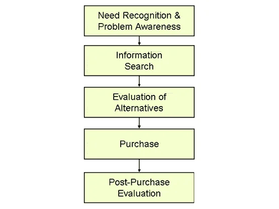
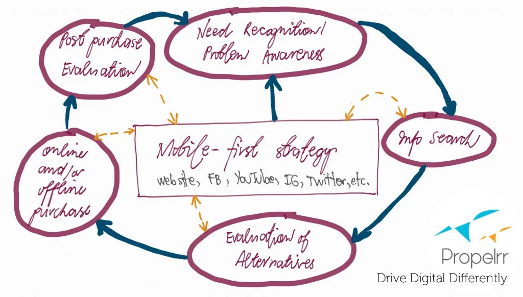
At present, mobile mixed with marketing seems to be disoriented, rather than being intimately connected, and cohesively communicated. With the screams of the smaller mobile screens, now is the best time to give the mobile-first strategy more than a second, third, or fourth thought. After all, while the channels have morphed into dizzying horizons, the rules of digital marketing are founded on a very old, and somewhat painfully familiar model which is the purchase decision making process model.

Just in case you are still in doubt, imagine this scene. How many times have your target market shared something via mobile devices and felt that they needed the brand just because they realized that they missed an old favorite, or have been caught in between the hyper hype from videos that went viral in only a matter of hours? This mobile-first purchase decision making process model disrupts in such a way that the decision process is being short-circuited.

Source: Propelrr
Now, a customer may search for a product because of a suggested post. Another user may only realize post-purchase discomfort when s/he sees an “I HATE XYZ BRAND” after years of being loyal to that brand. A not-so-far prospect may check out other brands, thanks to comments made by other users on a blog that people perceive as misleading or too much of a hard sell. You get the picture, brand people. After all, these insights are pretty much the same things you do whenever you’re engaged with your mobile devices, right?
Word of Mouth Marketing on Mobile
The only thing that has changed is that the process can happen in an instant or it can’t happen anytime soon. For brands that fail to get this in their design, chances are, conversion gets even scarcer. More so, word of mouth marketing has no longer been confined to family members, closest friends, and professional contacts. These days, word of mouth means:
An influencer. The person who is usually an early adopter or a gatekeeper. They are not confined to being bloggers. They may be X rockstars, Insta-meet addicts, or even in the person of a senator with witty one-liners and a published book.
A commenter. The one who would take time to comment on a post whether as an advocate or an antithesis. Comments that matter are not necessarily long. These comments should be well-researched and/or well-presented and/or well-supported.
A six-degree-of-separation connection. The person who your friends/family/colleagues know. For this person to be legit, s/he must bear credibility among the people whose opinion you value most.
A troll with a good number of following. Truth be told, bullies abound offline and online. What makes a troll roll is when people relate to the truth, half-truth, and non-truth that they say with gusto and a series of whoopie productions online.
Propelrr Pro Tip: Before proceeding with the whole shebang of a mobile-first strategy, it’s best that you come in clear about the ideal audience of all your marketing efforts across offline and online channels.
Call to Act: Solo Act Rule in Mobile-First Design
Have you ever reached a website with a mobile version and found yourself at loss with too many buttons plastered across your tab, phablet or phone? Perhaps you’ve been greeted by a page that says one too many things, that somewhat waste your already-too-little time. Or worse, you were not able to get the information you badly need; thus, you submit yourself to hitting the Close button or getting to a similar website that may answer your need.
Here in Propelrr, a digital marketing agency based in the Philippines, every single brand has to be prepared to answer an “existential” question: What is that one thing that you want your target market to do once s/he reaches your website?
This is rather a question that brings us and the teams with work with to a series of brainstorming sessions, followed by a rally of emails, personal meet ups, and/or Skype huddles. The rationale? Simplify your consumer’s journey by giving them what your brand promises.
Super Stand Out Strategy in a Super Saturated Market Via Mobile
Say you’re one of the many premiere Boracay destinations – a market where positioning is rather too hard to get, given that Boracay is already very saturated. What you can do is to get your target market to feel that the next thing that they must do should they reach your site is to hit that “Book Now” button.
How do you nail down a mobile-first strategy that leads to a successful customer journey, exactly?
Prime them with what you offer. In its simplest sense, go back to your product and service. Strip it down to benefits first, brand message second, and eventually features (if you have more space; which is a rather very rare case.)
Lay down your cards on a table as small as your screen. Is it an exclusive sanctuary that is far the hustle and bustle of Boracay? If so, then make sure that this is visually communicated in your home page. Forget the “About Us” first mentality. Forget the frilly welcome notes. Forget the sign-up-first-before-you-enter this site. Forget the email pop up trick.
Offer them something worthwhile. This is where your promotion prowess comes in the picture. Get your consumer insights, your hotel guestbook, and your survey forms. Scour it for the usual things that make consumers smile and frown, too. Peel your eye for details which can translate to offers that make your market feel your brand at its closest.
How about a series of rooms perfect for a family on a budget? By family, we mean the clan and extended clan reunion type of reservation. What is it that they ache for? Lower room rates? More upgrade? An exclusive access to a sedated and private beach?
Make things load fastest and see your sales go fattest. Every millisecond of having to wait for your website to load is just a testament that you’re a brand that does not care. No amount of warmth on the reception will mirror the apathy of your online storefront. No great view will be witnessed because of the irksome feeling that is brought by a failed transaction.
Ensure that security checks are in place, at all times. For sites that require personal details and payments, it is but a must that your brand makes the consumers feel and know that they are entering a transaction in good faith. Security checks must be plugged in at points where consumers cross the line from being a window shopper to a legit buyer.
Design glocally. Win more markets. An advantage of brands who go online is that they have better batting average to win local and global audiences. Make sure that your design is something universal. Meaning, it could easily be understood by a target audience who may have the same needs and wants, yet have diverse culture.
Answer one question with one answer. Remember: Any website must be about bringing the most convenient and most satisfying customer journey that nails down Attention, Intent, Desire, and Action. Simple marketing. Yet usually complicated and doused with too many unnecessary elements.
Propelrr repeats: What’s that one thing that you want your consumers to do as soon as they reach your site? One thing. Only one. Just one. One and only.
Pre-test, post-test, and calibrate your consumer’s journey. A/ B testing is much like the good, old advertising tests. The only difference is that you no longer have to waste three months or so to see whether your campaign (in this case, the mobile-first strategy) made an impact
While strategist, designers, and creatives pool together to build a website that speaks and breathes consumers-come-in-anytime-all-the-time, the truth test of the pudding comes with conversion-driven clicking.
Conversions, Alterations, and Mobile Goes On and On
The beauty of an online storefront derived from a mobile-first strategy is that it can be calibrated on real-time. The flexibility of maneuvering both your promotional strategies and even your marketing budget spend is more manageable.
Optimal ad spend, in Propelrr speak, is a manner by which brands, marketers, and business owners can actually define why they move buttons around; why they build their websites, again; and most importantly, zero in on the factors that lead mobile window shoppers as they go about their successful customer journey.
Now that you have a rundown of what makes a mobile-first strategy is made of, where do you see your site (and your brand) a week or so from now? Are you in need of a major overhaul or a few tweaks would lead you to an awesome customer journey tricks?
